
Get affordable and hassle-free WordPress hosting plans with Cloudways — start your free trial today.
Experimental: Check browser support before using this in production.
The CSS shape() function enables us to more easily create complex paths, polygons and other shapes using a more human readable syntax using lines, arcs, and curves. It also allows much greater flexibility and responsiveness in the use of units than the CSS path() function.
.icon-plus {
  clip-path: shape(
    from calc(50% - 10%) 0,
    hline to calc(50% + 10%),
    vline to calc(50% - 10%),
    hline to 100%,
    vline to calc(50% + 10%),
    hline to calc(50% + 10%),
    vline to 100%,
    hline to calc(50% - 10%),
    vline to calc(50% + 10%),
    hline to 0,
    vline to calc(50% - 10%),
    hline to calc(50% - 10%)
  );
}
About CSS shapes
There are several things that can be called “shapes” in CSS. There are CSS shapes that use the shape-outside and shape-margin properties, as well as shapes you can create using quirks in CSS like triangles, circles, dodecahedron, etc. While the shape() function can also provide the latter, it’s not used for drawing a shape (e.g. dodecahedrons) in the same way you may be used to thinking.
Currently, the only way to produce visible shapes with the shape() function is by using clip-path, meaning you have to create a cookie cutter, so to speak, and cut that cookie out from another element before you can see the shape. That said, there are many articles (even on CSS-Tricks) that reference creating shapes because once you have a cookie cutter, everything looks like a cookie… err… it’s easy to create those shapes, but understanding that there’s an intermediate step between creating the cookie cutter and seeing the shape it produces is an important part of understanding how shape() works and creating new shapes yourself.
You can also use the shape() function with the offset-path property to animate an element along that path, but that doesn’t produce a visible shape. In the future, you’ll be able to use it anywhere that requires a CSS basic shape primitive, but, as of this writing, clip-path and offset-path are it.
Basic usage
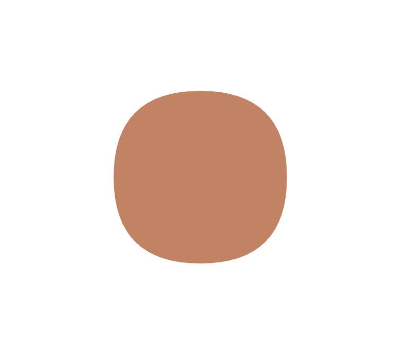
Let’s start by cutting out a round-ish cookie using clip-path:
<div class="cookie"></div>.cookie {
background-color: #C28365;
width: 200px;
height: 200px;
clip-path: shape(
from 100px 10px,
curve to 190px 100px with 190px 10px,
curve to 100px 190px with 190px 190px,
curve to 10px 100px with 10px 190px,
curve to 100px 10px with 10px 10px,
close
);
}
We can also use the shape() function on an offset path to create an animation. Let’s animate the cookie along its own path:
.cookie {
  background-color: #c28365;
  width: 200px;
  height: 200px;
  /* Cuts the shape out of the element */
  clip-path: shape(
    from 100px 10px,
    curve to 190px 100px with 190px 10px,
    curve to 100px 190px with 190px 190px,
    curve to 10px 100px with 10px 190px,
    curve to 100px 10px with 10px 10px,
    close
  );
  /* Defines the animated path */
  offset-path: shape(
    from 100px 10px,
    curve to 190px 100px with 190px 10px,
    curve to 100px 190px with 190px 190px,
    curve to 10px 100px with 10px 190px,
    curve to 100px 10px with 10px 10px,
    close
  );
  offset-distance: 0;
  /* Applies the animation */
  animation: cookie-path 10s linear infinite;
}

/* Defines the animation */
@keyframes cookie-path {
  from { offset-distance: 0; }
  to { offset-distance: 100%; }
}
Here’s a video showing the result in case your browser doesn’t support shape() just yet:
We’ll use the clip-path property in examples because it’s much easier to visualize how the shape() function works with it than with offset-path. But the shape() function works the same with both CSS properties, just one is for motion.
Keywords
The shape() function accepts a number of keywords used to define where and how shapes are drawn.
Fill rule
The first keyword in the shape() function (which was omitted from the above examples because it’s optional) is the “fill” rule. This tells the browser how to fill the shape with color. There are two options: nonzero and evenodd (the same as in SVG). In most shapes, they work the same, however, when a shape overlaps itself or has overlapping shapes, the algorithms differ on what they fill with color and what they don’t.
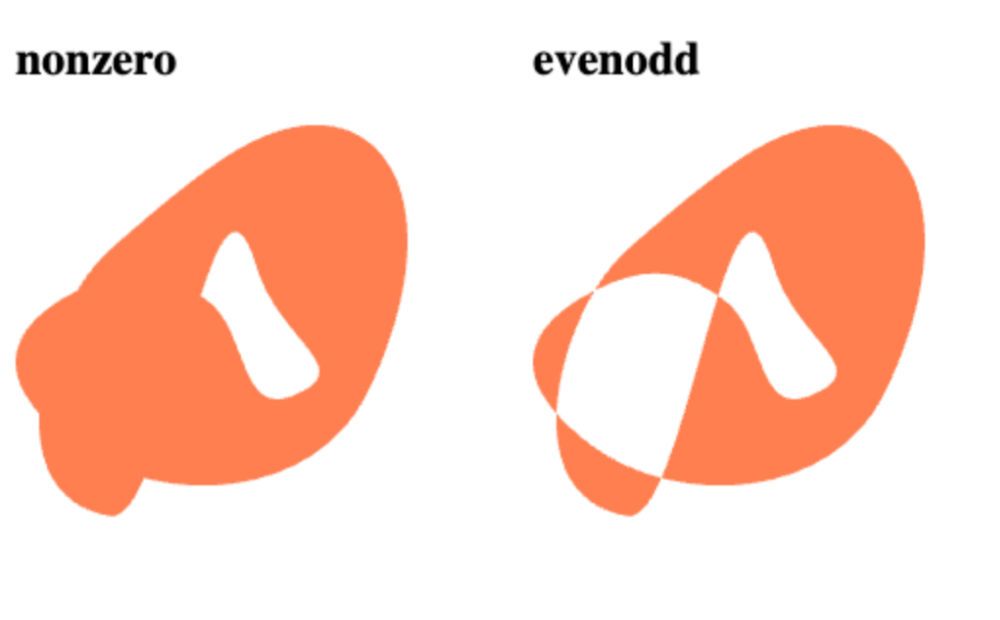
The algorithm descriptions below are included for completeness. You don’t need to understand how the algorithms work to use shape(). Most of the time you can use the default value (nonzero) and it will work the way you’d expect. If it ever isn’t working the way you want, try switching to evenodd. And if that doesn’t work, then the fill rule isn’t the issue.
nonzero(default): The browser picks a point and draws a ray (a straight line) out of the shape. The browser also sets a direction along the shape’s path (basically, if it were being drawn, it chooses a direction the pen is moving in to complete the shape). It doesn’t really matter where it starts or which direction it begins in because the algorithm only cares about the ray crossing paths that move (or are drawn in) opposite directions. When the ray crosses part of the shape’s path, the browser increments or decrements a counter. If the ray crosses a part of the path moving in a clockwise direction, the browser increments; if the path is moving counterclockwise, the browser decrements. When the resulting counter is not zero, the point is inside the shape and within the fill. If the counter is zero, the point is outside.evenodd: The browser picks a point and draws a ray (a straight line) from that point out of the shape (it does not care about the direction of the shape’s path). Every time the ray crosses a path of the shape it increments a counter. If the counter ends as an odd number, the point is considered inside the shape and within the fill. If the counter is even, the point is outside the shape.
from
Next, it’s time to set a starting point for the shape. You do this using the from keyword then setting the X and Y coordinate relative to the reference box (by default this is the box including the element’s margin). One of the benefits of using the shape() function instead of the path() function (we’ll compare these in greater detail later) is that you can use any CSS unit (or math function) to set your starting point and your additional points. You can also use keywords like top, bottom, left, right, and center. If you only use one value, it will assume that is the X coordinate and set the Y coordinate to center.
But wait, there’s an exception! If you use the top or bottom keywords, it will use this as the Y coordinate and set the X coordinate to center.
The from keyword should be followed by a comma. You can also think of this as the first move command (discussed below).
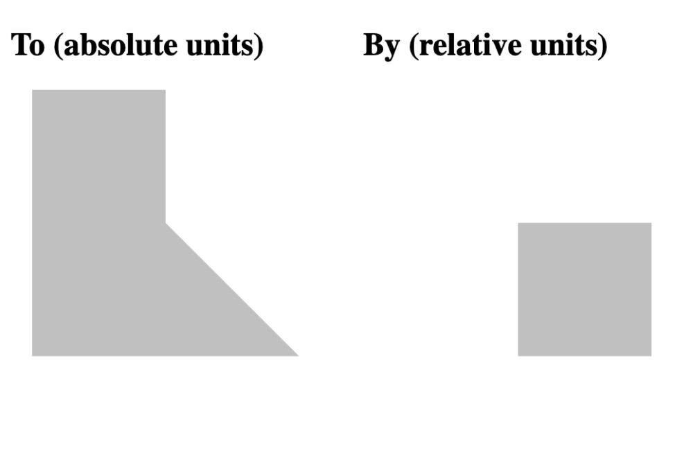
to vs. by
In the next section, we will discuss specific shape commands for drawing lines, arcs, and curves. That syntax will use a particular shape command followed by either the to or by keywords, plus the coordinates associated with that shape command.
move to 10px 10px,The difference between to and by is that coordinates following to are absolute coordinates (move to this coordinate) vs. by being followed by relative coordinates (move by this amount). This is the same as the capitalized commands (absolute coordinates) vs. lowercase commands (relative coordinates) in SVG.
Shape commands
These are the same as the path() commands used by SVG, but they have a more human readable syntax and are not limited to using pixel lengths. All shape() commands, except the last in a sequence, should be followed by a comma. All shape() commands take the previous command’s endpoint as the starting point. The first shape() command in the sequence uses the point set in the from line as its starting point.
For the sake of simplicity, I will only use the by keyword in shape commands below, but to is equally usable in all of the commands. Also, while I will often use the word “draw” to describe how a shape() command works, it’s important to remember that these commands do not show anything on the screen (the way the equivalent commands would in most SVG contexts), but rather are defining the shape of the cookie cutter that will be cutting out the shape from an element or, when using offset-path, defining the path an element will be animated along.
Move (move)
The move command is like picking up the pen while drawing and moving to a new location allowing for multiple, unconnected shapes to be created using a single shape function. Think of it as the equivalent to the SVG M command when using the path() function.
move by 10% 0,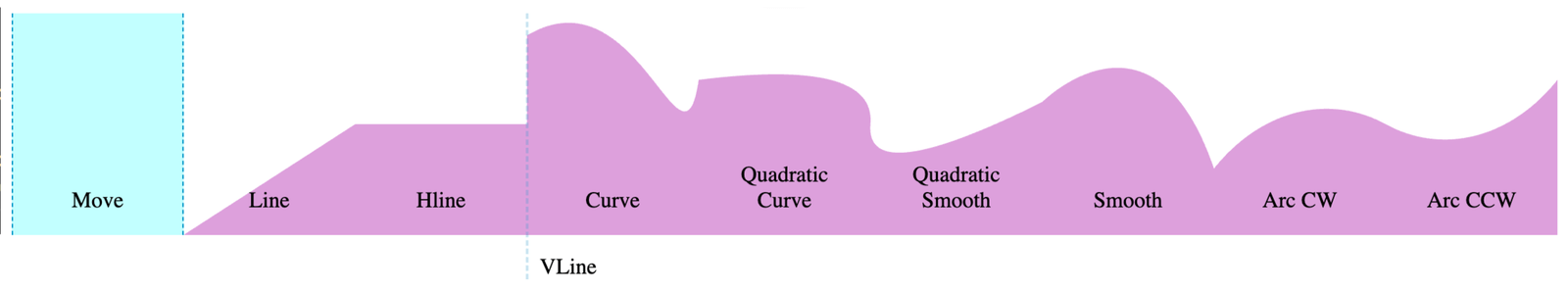
Line (line)
The line command draws a line from the starting point to the provided coordinates. Think of it as equivalent to the SVG L command when using the path() function.
line by 10% -5em,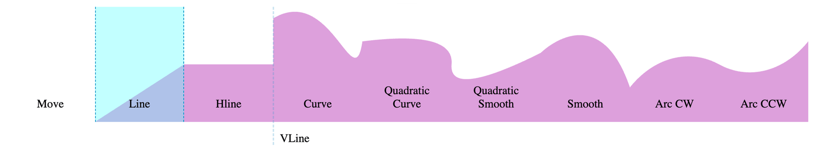
Horizontal line (hline)
The hline command draws a horizontal line from the starting point to the provided X coordinate. Think of it as the equivalent to the SVG H command when using the path() function.
hline by 10%,
Vertical line (vline)
The vline command draws a vertical line from the starting point to the provided Y coordinate. Think of it as the equivalent to SVG’s V command when using the path() function.
vline by -4em,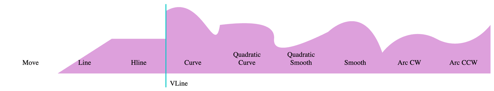
Curve (curve)
The curve command draws a Bézier curve from the starting point to the provided coordinates. The curvature is defined by the control points. To set control points, add the with keyword and then the first set of coordinates.
curve by 10% 2em with 5em -3em,If you only include a single control point, the browser will draw a quadratic Bézier curve (which is equivalent to the SVG Q command when using the path() function) where the point provided is used as the control point for both ends of the curve. If you provide two control points (which is equivalent to the SVG C command when using the path() function), it will draw the curve using the first provided point as the control point for the starting point and the second as the control point for the end point.
The two control points should be separated by a forward slash (/).
curve by 10% 2em with 5em -3em / 7em 7em,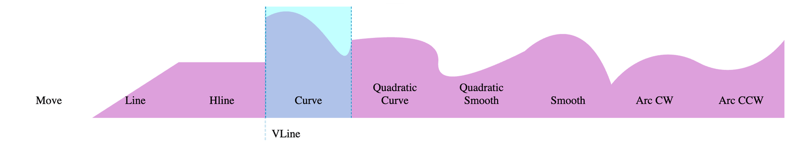
curve by 10% 2em with 8em -1em,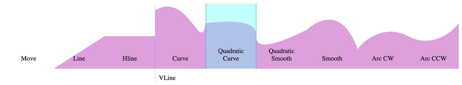
Smooth (smooth)
The smooth command draws a Bézier curve from the starting point to the provided coordinates, but uses mirrored control points to try to make smooth transitions from one curve to the next. The smooth command mirrors the control point from the previous shape command as the control point for the curve’s starting point.
As such, you can either omit the control point (which is equivalent to the SVG T command when using the path() function) which sets the mirrored control point as the control point for both the starting and ending point. Or you can include a control point. It will be the control point for the end point (and use the mirrored point as the control point for the starting point), which is equivalent to the S command in SVG.
smooth by 10% -1em,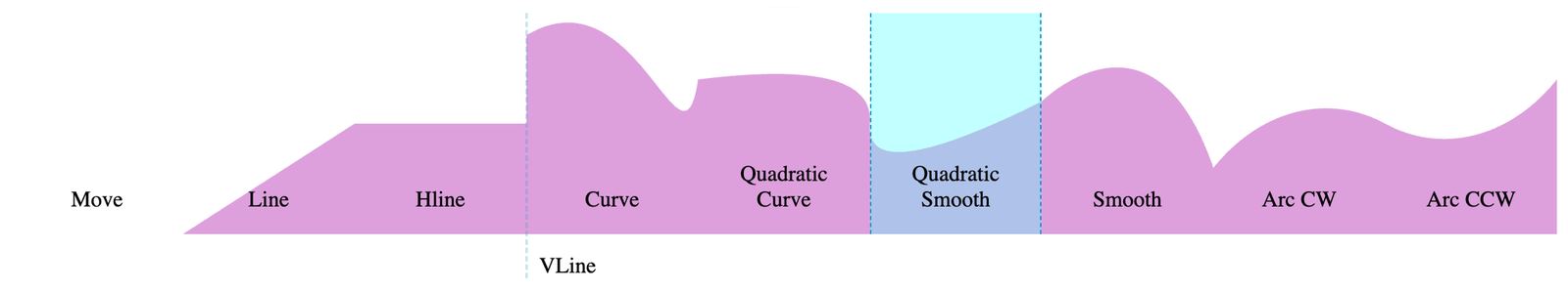
smooth by 10% 3em with 5em -5em,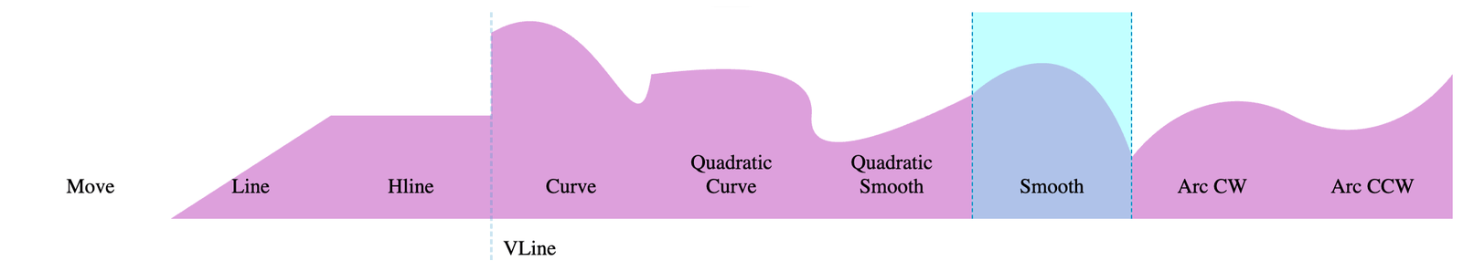
Note: When a smooth command follows a non-Bézier curve command and has no control points defined within it, the smooth command uses the starting point as its control point, effectively becoming the line command.
Arc (arc)
The arc command draws a portion of an ellipse between the starting point and the ending point, which is equivalent to the A command in SVG when using the path() function.
After that, you need to set the radii of the ellipse. Use the of keyword and then set two percentage lengths. The first length percentage is the arc’s horizontal radius (X axis) and the second length percentage is the arc’s vertical radius (Y axis). If set only one length, then the arc uses the same value for both radii, making it a circle. In that case, the angle and the arc-size flag, which we’ll discuss shortly, have no effect.
Having set this information, there are still four possible arcs that this information could pull from an ellipse. As such, the arc command has two flag features that let you determine which portion of the ellipse you want to use.
First we have the “arc-sweep” that determines whether you want the arc to go in a clockwise (cw) or counterclockwise (ccw) direction. It’s easiest to think of this by putting the start and end point on the face of an analog clock. If you want it to sweep in the same direction as time, then you want clockwise. If you want it to sweep against time, then you want counter-clockwise. If omitted, ccw is the default.
Second, we have the “arc-size” that determines whether you want the smaller portion of the ellipse defined or the larger portion. If you stick your starting and ending points on an ellipse and draw a straight line that intersects both points, you’ll cut the ellipse in two segments. Do you want the larger portion (large) or the smaller portion (small)? If omitted, small is the default.
Here’s the diagram directly from the spec:
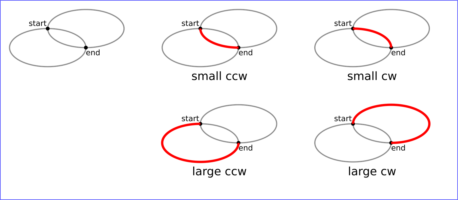
Finally, we need an angle relative to the X axis for how much the ellipse should be rotated through the points. Add the rotate keyword and then the angle in degrees. The default value is 0deg. Positive degrees rotate it clockwise; negative degrees rotate counter-clockwise.
arc by 10% -2em of 10% 90% cw small rotate 5deg,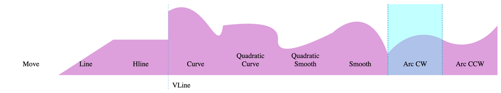
arc by 10% -2em of 10% 90% ccw small rotate 5deg,
Close (close)
The close command does what you might think: it closes the shape, drawing a straight line between the endpoint of the last shape command and the starting point. If a move command directly follows the close command, then it sets a new starting point. It is equivalent to the Z command in SVG when using the path() function.
closeshape() vs. path()
There are two big differences between the path() function and the shape() function:
- The
path()function requires you to know SVG path commands that are written more for brevity than for human readability. Theshape()function provides much more human-readable code that requires less mental decoding to read and understand. - The
path()function implicitly only allows for pixel measurement. As such, it is very difficult to create shapes that are responsive or otherwise scale smartly. Theshape()function allows you to use any CSS unit and also the results of any math function to create both dynamic and responsive shapes.
Okay, I lied, there’s kind of a third difference, but it’s really more of a non-obvious part of the second difference. Because you can use the results of functions, you can also use custom properties to define portions of a shape function’s arguments, making them even more dynamic, reusable, and responsive.
It should also be said that because of its dynamic and responsive abilities, you can do things with shape() that you just can’t do with path() unless you have some JavaScript dynamically updating path()’s values.
Creating shapes
While I highly recommend learning the shape() commands so you can create and manipulate shapes, they are a lot of work. It’s also really hard to visualize what you’re working on when you can’t actually see it until you’ve competed the shape (or at least enough to have a closed shape). For that reason, I suggest starting by creating a vector shape in a graphics editing program that can output to SVG, particularly for complex shapes.
Once you output the SVG code, you can put the path coordinates in a tool like Temani Afif’s Path to Shape Converter or Matthew Morete’s version to generate the CSS in the form of the shape() function.
If you must write your shape() by hand instead of using a generator, then it’s usually best to start piecemeal so that you can visualize it as you go. An easy way to get started is to draw straight lines back to your starting point. As long as you’re not starting with a move, hline, or vline, the following starter code should help.
If your end point is above your starting point (i.e., the end has lower Y coordinate) and you want to fill below the line segment, or your end point is below your starting point (i.e., the end has higher Y coordinate) and you want to fill above the line segment, start with this:
.new-shape-v {
  clip-path: shape(
    from *start-x* *start-y*,
    *Your first shape command*,
    vline to *start-y*,
    close
  );
}
Alternatively, if your end point is above your starting point (i.e., the end has lower Y coordinate) and you want to fill above the line segment, or your end point is below your starting point (i.e., the end has higher Y coordinate) and you want to fill below the line segment, then start with this:
.new-shape-h {
  clip-path: shape(
    from *start-x* *start-y*,
    *Your first shape command*,
    hline to *start-x*,
    close
  );
}
This should help you visualize your first shape() command. You can then add more shape commands between your first shape command and the vline/hline command until you’ve finished your shape or a shape command needs to cross the horizontal line through the starting Y coordinate or the vertical line through the starting X coordinate, respectively. You can delete the vline/hline and finish your shape as you see fit.
See the article series “Better CSS Shapes Using shape()“ for an in-depth tutorial on drawing shapes with examples and exercises to help you learn the syntax.
Examples
Browser support
While full browser support is coming, the shape() function is currently supported only in Chrome, Edge, and Safari browsers at the time of writing. You can follow its progress in Firefox in Bugzilla Ticket #1910328.
As of the writing of this article, full support isn’t here yet. The path() function covers many of the abilities of shape(). If you create a shape() from a path(), you can plop that path in a path() function and add it to a clip-path property above the shape() and get at least the shape itself correct even if you don’t get all the dynamic and responsive goodness of the shape() function. To polyfill for all the dynamic and responsive goodness, you’ll have to implement some JavaScript to update the path() on the fly.
Specification
The CSS shape() function is defined in the CSS Shapes Module Level 2 specification, which is currently in Editor’s Draft status at the time of writing. That means the information could change between now and when the specification becomes a formal Candidate Recommendation.
More information
- “The CSS
shape()function” (WebKit Blog) - “Use
shape()for responsive clipping” (Chrome for Developers Blog) - “Arc Shape With Rounded Edges” (CSS Tip)
- “
shape(): A New Powerful Drawing Syntax in CSS” (Frontend Masters)