
Get affordable and hassle-free WordPress hosting plans with Cloudways — start your free trial today.
Experimental: Check browser support before using this in production.
The animation-timeline CSS property controls the progress of animations using timelines beyond the traditional document timeline. Typically, CSS animations progress based on the amount of time passed in the document’s default timeline, which begins when the page is loaded. With animation-timeline however, you can link an animation’s progression to scrolling or when an element is visible in the viewport, which are different types of timelines.
At its core, animation-timeline simply connects an animation’s progress to one of these timelines. This is super useful, as it allows you to create scroll-based and other animations based on when something enters the screen.
Basic syntax
animation-timeline: <single-animation-timeline> = auto | none | <dashed-ident> | <scroll()>- Initial value:
auto - Applies to: all elements
- Inherited: no
- Percentages: N/A
- Animation type: N/A
The dashed-ident is a case-sensitive identifier that begins with two dashes (--) followed by a name you specify. In this case, it refers to a named timeline previously declared with the scroll-timeline-name or view-timeline-name properties.
scroll()is a CSS function that returns an anonymous scroll progress timeline.view()is a CSS function that returns an anonymous view progress timeline.
Scroll progress timelines
The scroll progress timeline measures the distance a user has scrolled within a container that allows scrolling. Think of it as a progress bar tied to the user’s scroll position. The position is converted into a percentage value which is then used for the animation progression.
We call this scroll container the “reference container” and it can be specified either through a named scroll progress timeline or anonymously. Let’s break down the differences between named and anonymous timelines.
Named timeline
A named scroll progress timeline is a timeline that you give a name to. You literally provide a name for the timeline using the scroll-timeline-name property:
.scroll-container {
  overflow-y: scroll;
  scroll-timeline-name: --imageTimeline;
}
From there, we can use the animation-timeline property to link the scroll-timeline-name to the element that is being animated.
.scroll-container {
  overflow-y: scroll;
  scroll-timeline-name: --imageTimeline;

  img {
  animation-timeline: --imageTimeline;
  }
}
And finally, we can create the animation:
.scroll-container {
  overflow-y: scroll;
  scroll-timeline-name: --imageTimeline;

  img {
    animation-timeline: --imageTimeline;
  }
}

@keyframes grow {
  from {
    transform: scale(0.5);
  }
  to {
    transform: scale(2);
  }
}
…and then apply that animation to the animated element:
.scroll-container {
  overflow-y: scroll;
  scroll-timeline-name: --imageTimeline;

  img {
    animation-name: grow;
    animation-timeline: --imageTimeline;
  }
}

@keyframes grow {
  from {
    transform: scale(0.5);
  }
  to {
    transform: scale(2);
  }
}
As of the time of this writing, Firefox requires the animation-duration property to be set on the animated element for the scroll animation to work:
img {
  animation-name: grow;
  animation-timeline: --imageTimeline;
  animation-duration: 1ms; /* Firefox requires this */
}
Anonymous timeline
Unlike named scroll timelines that we name ourselves, an anonymous scroll timeline does not have an explicit name. It’s implied. And we imply it using the scroll() function:
animation-timeline: scroll(<scroller> <axis>);Notice how we do not have to set a scroll-timeline-name anywhere. Instead, we’re telling CSS that the element we’re animating is a scroll animation using the scroll() function. This function links the animation to a specific scroll container element (called the “scroller”) and its movement along either the horizontal x-axis or the vertical y-axis.
Here’s the same effect as the named example, using scroll() instead:
.scroll-container {
  overflow-y: scroll;

  img {
    animation-name: grow;
    animation-timeline: scroll();
    animation-duration: 1ms; /* Required in Firefox */
  }
}

@keyframes grow {
  from {
    transform: scale(0.5);
  }
  to {
    transform: scale(2);
  }
}
So, rather than giving the scroll container an explicit name, we’re simply telling CSS that the image element follows the scroll() timeline of the nearest scroll container, which in this case, is the .scroll-container element. That’s the difference between an anonymous scroll timeline like this and one that we name.
View progress timelines
The second type of timeline we can link is not based on scrolling, but when an element is visible in what we call the “scrollport” and where it is in the scrollport.
So, what exactly is the scrollport? It’s the visible, scrollable area of a scrolling container. Think of it as the part of the container you can see and scroll, minus any padding, borders, or scrollbars.
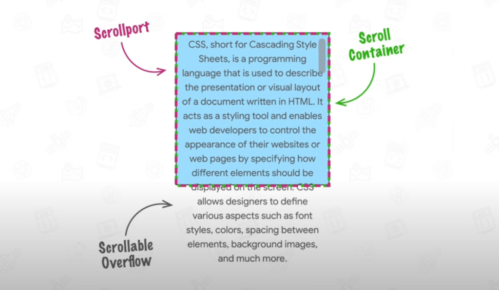
padding-box. When a scrollbar is present, that plus the scroll container is the root scroller, or the scroll container.A view timeline tracks the relative position of a subject within a scrollport. If you’re familiar with the Intersection Observer in JavaScript, then you already have a good idea of view timelines in CSS because they essentially work the same.
We can begin an animation on the scroll timeline when an element intersects with another, element such as the target element intersecting the viewport, then it progresses with scrolling.
With view timelines, the animation only starts and progresses when the element is visible, keeping everything perfectly in sync.
Named timelines
Similar to scroll timelines, a named view timeline is explicitly linked to an element using the view-timeline-name property and then referenced with animation-timeline for animations. The key difference here is that the subject (the element controlling the timeline) doesn’t have to be the same as the target (the element being animated).
This provides great flexibility because:
- you can animate one element based on another element’s movement in the viewport, and
- animations can depend on a separate element’s visibility or position within its scrollable container.
For example, you could fade in a “scroll to top” button once a specific section is visible, or have a caption slide in when its corresponding image enters the viewport. Let’s take a look at a basic example:
<p>Some content.</p>
<img src="img.png" />
<p>Some more content.</p>
img {
view-timeline-name: --imgScale;
animation-timeline: --imgScale;
animation-name: scale;
animation-duration: 1ms; /* Required in Firefox */
}
@keyframes scale {
from {
transform: scale(0);
}
to {
transform: scale(1);
}
}In this example, the image scales up from 0 to 1 as you scroll through the scrollport. The subject and the target are the same element in this example — the image — since the animation is applied based on the image’s progress up through the scroller.
You may notice that the view timeline animation finishes just as the element exits the viewport — this is because the timeline’s progress reaches 100% at that point. As a result, you don’t get to see the complete animation. The proper way to address this is by using the animation-range property. See the “Timeline Ranges Demystified” section in the article “Unleash the Power of Scroll-Driven Animations” for an explanation of how it is used to fine-tune the progress of scroll animations.
Anonymous timelines
Just like scroll timelines have the scroll() function for linking anonymous timelines, view timelines have the view() function for anonymous view timelines. And the concept is the same, only it is based on the target element’s position in the scrollport. It allows an element (the subject) to animate based on its visibility progress within its closest scrollable container (scroller). You can choose which axis — vertical or horizontal — and the animation progress is tracked from there.
Unlike scroll(), the view() function always uses the element’s nearest scrollable ancestor as the scroller, so you don’t need to define one manually. By default, the axis is block, and the inset is auto (no adjustments).
animation-timeline: view(<axis> <view-timeline-inset>);For example, converting the named view timeline example we discussed earlier to an anonymous one:
img {
  animation-timeline: view();
  animation-name: scale;
  animation-duration: 1ms; /* Required in Firefox */
}

@keyframes scale {
  from {
    transform: scale(0);
  }
  to {
    transform: scale(1);
  }
}
Examples
In this section, we’ll explore a range of examples that showcase how scroll and view timelines can be applied. We’ll begin with straightforward use cases and gradually tackle more advanced scenarios. For more inspiration, check out this fantastic site by Bramus, featuring a collection of demos using the animation-timeline property.
Scroll progress bar
Scroll progress bars are a popular feature in blogs and articles and give readers a visual indicator of their progress. Usually, the implementation involves JavaScript and a bunch of calculations. Scroll timelines make things much easier:
This implementation is straightforward: the width of the progress bar is linked directly to the scroll progress of the document. We are directly using the scroll() function as there is no need to specify the scroller or axis (the root scroller and vertical (y-axis) scrolling are chosen by default, which is what we want).
Shrinking header
A shrinking header is a common feature where the header becomes smaller as you scroll down. This can be done by linking the header’s height to a scroll timeline or using a view timeline based on its visibility. We’ll use the scroll timeline method because it’s simpler and gives more control. With animation-range, the header will shrink only within a specific scroll range and stay the same size outside of it.
The example uses animation-range to shrink the header only during a specific scroll range. Instead of shrinking across the whole scroll, it happens between 0px and 500px. Since the <main> height is 2000px, this effect takes place in the first quarter of the scroll.
animation-name: shrink;
animation-timeline: scroll();
animation-duration: 1ms;
animation-range: 0px 500px;
Text reveal
You’ve probably seen websites where text appears to reveal itself as you scroll, almost like a typewriter effect. This could involve fading text in word by word, letter by letter, or changing color dynamically. Let’s recreate this effect using CSS.
In our example, we’ll start with a line of text in a light grey color. As you scroll, the text will gradually change color, one character at a time. We’ll use a background linear gradient to highlight the text. This will then allow us to animate the background’s size, creating the illusion of characters being “colored in” one at a time. The scroll timeline will be ideal for this case.
There are a couple of things to unpack here. First, let’s look at the background:
background: linear-gradient(90deg, #1a1a1a, #1a1a1a) 0/ 0px no-repeat #cecece;Initially, the background is set to #cecece for the entire text. The darker color, #1a1a1a, which will be used during the reveal, is positioned at 0px and has a size of 0px. This sets up the reveal effect.
Next, the animation is linked to the scroll percentage:
animation: reveal .1s;
animation-timeline: scroll(root);

@keyframes reveal {
  to {
    background-size: 100%;
  }
}
As you scroll, the animation adjusts the background size, gradually expanding it to 100%, to reveal the text. You can improve this further using the steps() function alongside ch units so that each character “snaps” into color. Here’s a cool implementation of that.
Note: The snapping effect works best with monospace fonts because 1ch represents the width of a character. In variable-width fonts, 1ch is based on the width of the 0 character, causing potential misalignment. Monospace fonts ensure consistent width for all characters.
SVG animations
You can make awesome scroll effects with SVGs. In this example, we’ll start with a grey circle that fills with red as you scroll down the page. This is just a basic idea, but you can build on it to create fun, interactive animations that cover the whole page.
<svg width="400" height="400" viewBox="0 0 400 400" xmlns="http://www.w3.org/2000/svg">
  <circle cx="200" cy="200" r="190" fill="none" stroke="#ccc" stroke-width="10" />
  <circle class="animatedCircle" cx="200" cy="200" r="190" fill="none" stroke="red" stroke-width="10" stroke-dasharray="1194" stroke-dashoffset="1194" transform="rotate(-90,200,200)" />
</svg>
We have two circles, the grey circle that will remain fixed and a red circle over it that is initially hidden. We will make use of stroke-dasharray and stroke-dashoffset to animate it. In case you are wondering, the value 1194 is the circumference of the circle (2*pi*r). We will animate the stroke-dashoffset from 1194 to 0, simulating a drawing effect. The transform: rotate(-90,200,200) ensures the animation starts from the top and moves counterclockwise.
Then, all you have to do is link the animation to the scroll-timeline. Here’s another example that you can check out.
Browser support
Note: Add animation-duration: 1ms for Firefox compatibility. The duration doesn’t matter, but Firefox needs this property for the animation to work.