React TextBox – Advanced Text Input with Floating Labels
- Enhanced input groups: Easily create input fields with icons, action buttons, help text, and real-time validation messages to improve usability and accessibility.
- Floating labels for modern UI: Add a sleek, contemporary look to your forms with floating labels that respond to user interaction and maintain clarity.
- Optimized for performance and responsiveness: Built to work seamlessly across devices and browsers, ensuring a consistent user experience.

Trusted by the world’s leading companies

Overview
The React TextBox (text field) is a component for editing, displaying, or entering plain text on forms to capture user names, phone numbers, email addresses, and more. This component is an extension of the HTML5 TextBox (input type text) component with icons, floating labels, sizing, grouping, validation states, and more.
React TextBox code example
Get started with the React TextBox using a few simple lines of TSX code as demonstrated below. Also, explore the React TextBox example that shows how to render and configure the TextBox in React.
import { TextBox } from "@syncfusion/react-inputs";

export default function App() {
    return (
        <div className="component-section">
            <TextBox placeholder="Enter your name" width={250} labelMode="Auto"/>
        </div>
    );
};
Controlled mode
The React TextBox component supports both controlled and uncontrolled modes, offering flexibility in managing its state. This dual-mode capability allows integration into a wide range of application architectures, accommodating different state management strategies.
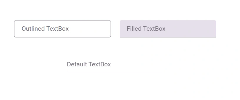
Variants
The React TextBox component enhances the user experience with three distinct visual styles: standard, outlined, and filled. Each variant offers a unique look and feel, allowing developers to tailor the input field’s appearance to match the design requirements of their application.
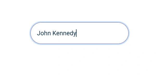
React TextBox with floating label
The React TextBox component floats placeholder text to the top of the input box with an animation when the input receives focus or has a value. The floating label is used to ensure the input value and labels are always visible.
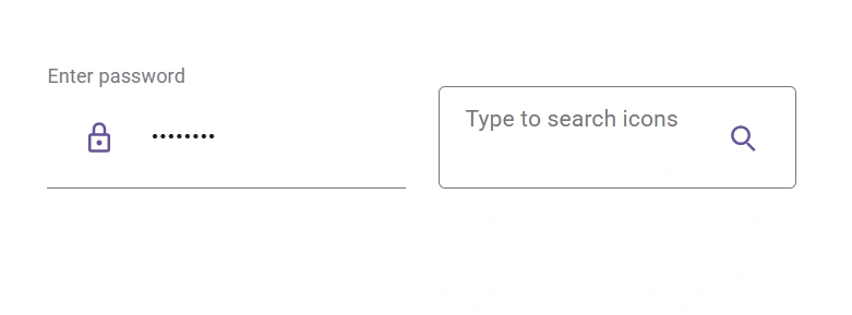
Input icons
Easily create input with icons by prepending or appending icons, buttons, or text with floating labels in the React TextBox component. For example, prepend text with a dollar symbol ($) for price input or an at sign (@) for usernames.
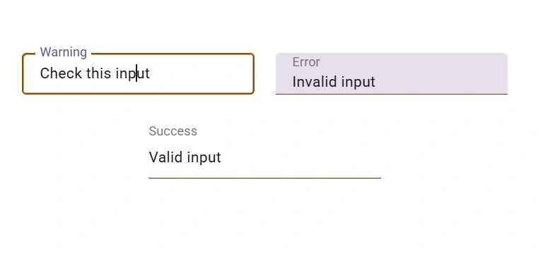
Input color
The React TextBox component includes built-in color indicators to visually represent success, warning, and error states, enhancing user feedback and improving form validation clarity.
Customization
Easily personalize the appearance of the React TextBox component by applying additional CSS class names. This flexible approach allows developers to modify styles such as borders, colors, spacing, and typography to align with specific design requirements.
Input sizing
The React TextBox component offers built-in size customization, supporting both normal and small modes. This ensures the input field maintains optimal padding and spacing for a clean and user-friendly interface.
Input validation with HTML forms
The React TextBox component can validate the input value and apply the corresponding validation styles for success, error, and warning states, which are used in most standard HTML forms.
Right-to-left (RTL) rendering
The TextBox component supports right-to-left (RTL) rendering. Users can change the text direction and layout of the component from right to left. This improves the user experience and accessibility for users who use RTL languages.
Developer-friendly APIs
Developers can control the appearance and behaviors of the React TextBox component, including its floating label, using a rich set of APIs.


Not sure how to create your first React TextBox? Our documentation can help.
I’d love to read it nowPure React Components
Developed using React’s core principles, this library employs functional components and hooks without any external dependencies.
GRIDS
DATA VISUALIZATION
NAVIGATION
INPUTS
Frequently Asked Questions
Why should you choose Syncfusion React TextBox?
- Provides an extended version of the HTML input element, supporting both pure-CSS and pure-JavaScript versions.
Easily create input with icons, buttons, help text, and validation messages.
- Add a modern look to your entered text and display floating labels using React.
Allows adjusting the input size.
Includes simple configuration and APIs.
- Supports all modern browsers.
- Touch-friendly and responsive.
- Delivers one of the best React TextBoxes on the market.
Reference extensive demos to learn quickly and get started fast.
Where can I find the Syncfusion React TextBox demo?
You can find our React TextBox demo here. It demonstrates how to render and configure the TextBox.
Can I download and utilize the Syncfusion React TextBox for free?
No, this is a commercial product and requires a paid license. However, a free Community License is also available for companies and individuals whose organizations have less than $1 million USD in annual gross revenue, 5 or fewer developers, and 10 or fewer total employees.
How do I get started with the Syncfusion React TextBox?
A good place to start would be our comprehensive getting started guide.
Rated by users across the globe
Syncfusion React TextBox resources


Awards
Greatness—it’s one thing to say you have it, but it means more when others recognize it. Syncfusion® is proud to hold the following industry awards.

