Categories
Design glamorous

My Glamorous Life: broken by design.

Debt brought on by large, unexpected expenses caused me to lose access to my credit card. I’d put a close friend’s storage unit in my name and on my credit card while they relocated and job-hunted. So my payments on my friend’s behalf were no longer going through, and the storage company began texting me about the missed payments.

Sounds straightforward, ordinary, and boring. Turned out not to be.

Meanwhile, my friend—after moving house twice—has landed a terrific job, and is beginning to dig themselves out of their debt. But they can’t pay the full amount of their storage fee yet. Or transfer the unit from my name to theirs.

They tried to make a partial payment by telephone, but the company’s “partial payment” line didn’t work.

It didn’t work in a highly specific way.

Specifically, it let them waste ten minutes entering data by hitting their phone’s keypad and typing “1” after each step to confirm the correct completion of that step. Then it told them that the payment had not gone through—asked them to “wait to speak to a manager”—and then immediately disconnected them.

Every time they tried, they got to that stage and were immediately disconnected. With all the goodwill in the world, my friend could not pay their bill.

“Nothing works” is working as expected.

I had enough cash in the bank to make a full payment on my friend’s behalf; and since the unit was in my name anyway, I followed the company’s text message instructions—sent to me personally—to pay the full bill online on their behalf and set up automated payments for future bills. They’d pay me back when they could. Eventually we’d transfer ownership. Such was my naive hope.

The website let me enter my data step by step, including “new card” data. I removed the defunct credit card info and replaced it with my debit card data. Unlike a credit card, my debit card never lets me spend more money than I have in the bank. That is a good thing when you’re in debt. My debit card is with one of the largest banks in the world. I’ve had the account for over 30 years. In short, it’s a stable account with a long history.

The website allowed me to enter my data, a process that took about five minutes.

When I hit “Send,” the website announced that the payment had failed to go through because the bill was past due.

The system is designed to block payments after first encouraging you to try sending them.

There I am, working to send them my money. And their system refuses. Their system already knows who I am. It told me my name, my storage unit number, and the amount due. It knew me. It knew what I owed. It was ostensibly built to take my money. It is a special phone number with a special automated system designed to take payments from known customers. And it failed every time I tried to pay.

Two design choices are worth noting.

  1. The system only accepts timely payments, not late ones.
  2. The system deliberately doesn’t tell you that it won’t accept your payment. It encourages you to waste time trying. That’s key.

Is the software poorly designed? Was their QA process less than perfect? Did some sadist deliberately set up the system to punish folks who are struggling?

The answer, of course, is yes. To all three questions.

I really tried.

I tried three times, even switching options. Like, the first time, I said NOT to use my debit card number to automatically pay my friend’s bills in the future. The next time, I said, OKAY, charge me forever. No matter what choice I made, the result was always: “The payment did not go through because the amount is past due.”

The more you owe, the more you’re not allowed to pay. Who chose those defaults? Elon Musk?

So I called the phone number they’d given me. Again, it was an automated line set up explicitly for existing cutomers to pay their bills.

The number was smart. It had been waiting for my call. It recognized my phone number and told me the storage unit’s account number. It remembered my old credit card number—the one it knows doesn’t work. It asked me if I wanted to pay with the card that doesn’t work. It allowed me to say “No.” It allowed me to enter the account number and other data for my “new” card—the debit card. It allowed me to type “1” each time I completed a step. It asked me to confirm that everything I’d entered was correct. I did. It asked me to hit “1” one final time to confirm making the payment. I did.

The automated phone voice then informed me that the payment had not gone through, instructed me to “hold the line to speak to a manager,” and immediately disconnected me.

Same as what had happened to my friend when they tried to pay.

I tried three times. Each time, the same. Enter a bunch of data. Say yes over and over. Hit the phone equivalent of Send. Get the same error message. Followed immediately by disconnection. (Why try three times? Why not two? Why not eleven? That’s a subject for another day.)

When one window closes, so does another. And another.

Clearly the payment line—like the website—was not working. So I looked up the company’s website to find their main number. Not the smart automated number that knew who I was and what I owed. A dumb number, but with a human being at the other end.

I figured I’d call the front desk and say that I’m trying to pay a bill and have an account number, unit number, and dollar amount ready to share. If the human being on the other end told me to use the “bill payment number,” I’d explain that the bill payment number wasn’t working at the moment, and ask them to please please pretty please ever so kindly allow me to send them my payment.

So I called and got a busy signal.

Hung up. Waited ten minutes, called again.

Busy signal.

I’d now wasted at least 30 minutes and it was a work day, so I turned my attention back to my job, and away from nut-grindingly pointless exercises in absolute futility.

After about an hour, I tried phoning the company’s main number once again. You know what I got: a busy signal.

Here’s what I think: I think if you’re late, this company’s systems stop working. Not because they don’t want your money—they do. But because they want you to suffer for being late. Before they’ll take your money, they want you to crawl. At one time, there was probably a Japanese news group dedicated to this kind of kink. And the beauty part, for the perverted, is that the pain is pointless and nonconsensual.

They want you to try paying them via the payment website till your eyes cross. They want you to dial the “payment” phone number and jump through your own anus until you tire of being disconnected. They want you to weep. They want you to curse. They want you to try dialing the main number one thousand skrillion times before you get through to a human being. They want you to break down in tears when you finally hear a human voice. Like you’ve been rescued from a desert island and forgotten the beautiful sound of human speech.

There’s probably a German word for the relief you feel after banging your head against the obtuseness of American business systems until you finally get a fraction of what should have been provided to you immediately. Like when the internet finally comes back on after an unexplained blackout. Or when the New York landlord finally fixes the water heater so you can stop washing your private parts in icewater. Or when your trainer finally says, “Good job, let’s go stretch.”

Making a payment should not be routine. It should be a privilege, forged in fire and earned in blood.

Mind you: I don’t know that there actually will be a human being at the end of the phone line if I spend all day Saturday trying to reach one, but, at the moment, that’s my plan. Try and try and try and try and try again and keep trying world without end ad infinitum until at some blessed hour, some stranger takes my money.

And here’s the point of all this:

I encounter broken systems like this almost every week.

As a UX person, it makes me nuts. Also as a human being. It’s not right. It’s not fair. And we all put up with it.

Even if you’re lucky enough to have a good job, and even if you live in a progressive city like New York, our increasingly automated business systems are not our friend. In short:

They want to take your job and replace you with a machine that doesn’t work.

Categories
Design

Writing in WordLand

This is a test. This is only a test. I’m using WordLand to write this post to my WordPress website. It’s a new, stripped-down writer’s tool for bloggers. Think of it as a frill-free writer’s frontend to the majesty of WordPress. The essential features (and some advanced ones, even) in a distraction-free, scribbler-friendly environment.

## An H2 subhead, my liege.

WordLand supports Markdown, I understand. It also supports direct bolding and links, of course. An overview of the features is available at the link I shared in the opening paragraph. For your convenience, here it is again: https://this.how/wordland/

WordLand doesn’t yet seem to include an affordance for ALT text. Either that, or I couldn’t find the affordance. Pretty likely that that will be corrected soon, as ALT text is a bottom-line basic necessity. (And, again, I may have simply overlooked an existing affordance.)

### An H3 subhead, your worships.

Hmm. More to come. WordLand is a creation of Dave Winer, one of the first bloggers, who also gave us RSS and lots more. Read more about Dave Winer on Wikipedia.

Okay, this was easy enough. For bloggers who mostly *write*, it’s a clean, distraction-free interface with strong basic features that lets you offload CMS duties to WordPress.

Noting that my subheads showed up as text with raw Markdown syntax also presenting as text. This was true even when I stopped writing *##* and replaced it with *h2*, for example. No doubt I’m doing something wrong, and that’s … okay.

I’ve updated this post six or seven times within the WordLand page itself, and the updates flowed seamlessly to the live site.

Update: Make that eight updates I’ve made to this post. 😉 Apparently the editor is WYSIWYG and stores the content in Markdown. I misunderstood the function of Markdown in the app (but I also didn’t carefully read every word of the support docs). Also, there’s supposedly built-in category support using a checkbox system. But I could not find the checkbox widget while using WordLand. That doesn’t mean there isn’t one—but if such an affordance does exist, it would benefit from being made more discoverable.

Categories
A List Apart Accessibility Authoring Best practices CSS Design development HTML interface IXD Layout Markup Real type on the web Responsive Web Design Site Optimization Standards State of the Web The Essentials type Typography Usability User Experience UX W3C Web Design Web Design History Web Standards webtype

Web typography: a refresher and history

Many designers still think in px first when creating baseline styles. But we know intellectually that various relative typography approaches are better suited to our medium in all its complexity. Better for accessibility. Better for avoiding bizarre typographic disasters linked to user preference settings, device limitations, and the unforeseen ways our overwrought styles can interact with one another.

As I contemplate a long-overdue redesign of my own site, it’s worth taking a refreshing dip into what we’ve learned about web typography over the past 20+ years. From the pages of (where else?) A List Apart:

Bojan Mihelac: “Power to the People: Relative Font Sizes” (2004)

An early and simple creative solution for text resizing that respects users’ choices and also gives them an additional option for resizing despite the limitations of some of the most popular browsers of the day. Presented for its historical importance, and not as a how-to for today. https://alistapart.com/article/relafont/

Lawrence Carvalho & Christian Heilmann: “Text-Resize Detection” (2006)

Detect your visitors’ initial font size setting, and find out when they increase or decrease the font size. With this knowledge, you can create a set of stylesheets that adapt your pages to the users’ chosen font sizes, preventing overlapping elements and other usability and design disasters. Presented for its historical importance as an insight into the complex dancing we’ve done in the past to ensure readability. https://alistapart.com/article/fontresizing/

Richard Rutter: “How to Size Text in CSS“ (2007)

Sizing text and line-height in ems, with a percentage specified on the body (and an optional caveat for Safari 2), provides accurate, resizable text across all browsers in common use today. An early move toward more responsive type and away from the accessibility problems created by setting text sizes in px in some browsers and devices. https://alistapart.com/article/howtosizetextincss/

Wilson Miner: Setting Type on the Web to a Baseline Grid

The main principle of the baseline grid is that the bottom of every line of text (the baseline) falls on a vertical grid set in even increments all the way down the page. The magical end result is that all the text on your page lines up across all the columns, creating a harmonious vertical rhythm. https://alistapart.com/article/settingtypeontheweb/

Tim Brown: “More Meaningful Typography” (2011)

Introduces modular scales, the golden ratio of readable typography. Delivers accessibility plus aesthetic beauty derived from the math underlying all of creation. https://alistapart.com/article/more-meaningful-typography/

Tim Brown: “What is Typesetting?” (2018)

“We must now practice a universal typography that strives to work for everyone. To start, we need to acknowledge that typography is multidimensionalrelative to each reader, and unequivocally optional.” https://alistapart.com/article/flexible-typesetting/

Keep going…

For more web design community wisdom and web typography history, see Typography & Web Fonts in A List Apart, for people who make websites.

And in the Comments below, please share your favorite resources for creating websites that look great and read beautifully, no matter what technical and human capabilities get thrown at them.

Categories
Design film glamorous people Websites

Forever

The first website my colleagues and I created was for “Batman Forever” (1995, d. Joel Schumacher), starring Val Kilmer. That website changed my life and career. I never saw “Top Gun,” but Val Kilmer made a brilliant Jim Morrison in Oliver Stone’s “The Doors.” Rest in peace.

Categories
AI Applications art art direction Design

This Years Model

There’s a new AI model that can render photorealistic people and products, including text and logos.

Geisha With Walkman is something I tried to draw 40 years ago, but my rendering skills were simply too poor. The Reve Image 1.0 preview allowed me to do it instantly this morning with a single, basic prompt.

P.S. I retro-updated the Walkman with an iPod to “modernize” the concept.

Categories
Advertising Collectibles Community content creativity Damned Fine Journalism Design Designers Desktops Digital Preservation Formats Free Advice glamorous HTML industry launches links music My Back Pages Own your content social media social networking software Surviving Tech Web Design Web Design History Web Standards Websites zeldman.com

My weekend project

It’s Sunday; I’m playing with my music collection, content as a fed-and-burped babe. Allow me to explain.

I realized last night that, in tracking my shifting musical tastes via my Last.fm Pro account, I’m basically remaking “Pardon My Icons,” the creative project I launched on this very website in 1995, back when it was still at a tilde address (it did not become zeldman.com until ’96), and which first brought my work to the attention of other creatives who were also discovering the early web and making it their own.

Me, collage, and music

Although I was not serious about it, I started making collage art when I lived in Washington DC in my 20s.

Back then I was serious about composing and producing. I used an Akai 12-track recorder, a rack of synth modules commanded by my Yamaha DX7 with a custom E! card, and a PC running Personal Composer MIDI, arranging, and composition software. I also had an old Selmer Bundy flute, an African reed instrument whose name I forget (and whose “reed” turned out to be a dried locust carcass, as I would discover, to my horror, when the instrument broke), Fender amps, mics, and a variety of percussion instruments with which I made music in my Washington, DC-based recording studio. But that’s a whole ’nother story.

I did not expect to earn a living as a composer, and in that negative expectation I was more than amply fulfilled.

So I scrounged up a day job at a local advertising agency as a naively optimistic copywriter.

And a night job as a stringer for The Washington Post’s Arts section.

Music journalist by night

The paper’s arts section editor in those days was named Richard. I’d gotten his attention without soliciting it after creating “Khz” for City Paper. Khz was my weekly music column. I covered the emerging go-go and hardcore scenes, as they were what was happening in DC, and the whole country would soon be listening. Naturally, the Post made me stop writing about that interesting and relevant stuff, and instead paid me $40 per to crank out anodyne concert reviews of mainstream artists like Kenny Rogers when their tours came through DC. (I was comped to the ticket but paid my own travel and gas out of the 40 bucks.)

I typically had 30 minutes from the time the headliner started to call in my review, which meant I had to write it in my head while watching the beginning of the performance, then run to a pay phone booth (kids, ask your parents) and dictate it aloud to someone on the copy desk, before the concert had even begun to build up a head of steam. This wasn’t fair to the artists. I did the best job I could under the circumstances, taking pride in how quickly I could structure and ship a news story. Richard fired me before I could quit, but that, too, is another story.

Most importantly at that time, I lived with a girlfriend. She was an artist and architect who had left that career to study computer programming. We were social (many friends, drinking was often involved), and serious about our art—which, in my case, was music, even if I earned my living writing concert reviews and crafting passable but hardly brilliant ads.

Through all of those ups and downs, and to the side of those major efforts, I kept at the collage for years, putting in several hours a night making the things. When each was finished—and deciding that any art product was finished was damned tough for my restless young mind—I would carefully frame it behind glass, and mount it on the walls of our apartment.

Was it art? Just a hobby? Who knows? It made me happy.

And then gradually, as I put more effort into my music and ad careers, I set the collage-making aside, for a time.

New career in a new town

Ten years later, I was a New York art director and copywriter, two years sober, and no longer in that same romantic relationship. That’s okay, I was in a new one.

I’d packed my music studio equipment—now obsolete because Akai stopped making the proprietary multitrack tape format that their 12-track unit ran on—in a storage unit. Eventually I’d give away all that music and recording equipment (keeping only the multitrack masters), but that, too, is another story.

Cutting-edge for a day

Then in 1995, one of our ad clients asked the agency if we could make them a website. Like many of you, we lied and said, sure. And then we figured out how to actually do it.

The client was Warner Bros., the project was “Batman Forever,” our visionary client was Donald Buckley, my partners were Steve McCarron, Alec Pollak, and Doug Rice, and the website was a huge hit, attracting half the people who visited the early web. (Alec’s “Flashback 1995: batmanforever” shares screenshots, which are great, although they cannot convey what a breakthrough the site was in March, 1995.)

With 3 million people using the web in 1995, the site got 1.5 million visits a day for over a year. Not bad.

Pardon my icons (1995)

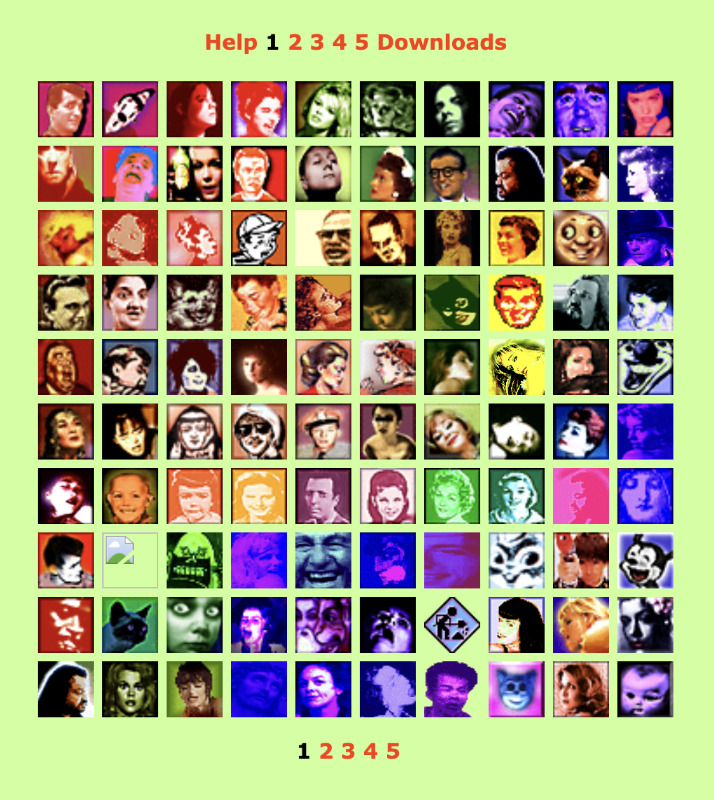
First gallery spread of “Pardon My Icons,” a zeldman.com entertainment from 1995 ff.

I immediately set to work creating a personal site (this one), and Pardon My Icons was one of its first “entertainments.”

As is often the case with my creative efforts, I made these tiny, Warhol-inflected bits of art as a protest against what I saw as the mediocrity of the icons in general use on that early, early web.

(Similarly, my friends and I would later start The Web Standards Project in protest against the dumb ways most folks were being told to create websites, e.g. using proprietary tags instead of W3C and ECMA standards, because browsers didn’t properly support those. Having lost access to my musical master tapes because I’d invested in Akai’s non-standard and eventually discontinued tape format, I was kind of keen on not letting the internet fall victim to the same kind of nonstandard f*ckery. But that, too, is another story. We are gathered here to talk about icons and collage. So let’s do that:)

A mental break

I track my music on Last.fm Pro. Here’s my account. (But don’t look unless you, too, have a Pro account. I’ll explain why in a moment.)

Photo spread: some of the artists I listen to, as shown on last.fm Pro.
Some of the artists I listen to, as shown on last.fm Pro.

Last.fm lists the artists you play, arranging them by the number of plays. Thus, if you were to play three tracks by Freddie Gibbs and two by Bill Evans, you’d have a collage featuring those two artists, with Freddie preceding Bill because he has one more play than Bill.

But if you play three tracks each of Freddie Gibbs and Bill Evans, then Bill will come first, because Bill comes before Freddie alphabetically.

Through such moves, over time, an ever-shifting collage unfolds. But only in Last.fm Pro.

In regular, free old last.fm, you can see other people’s artists as a list, arranged by number of plays, interrupted by an ugly barrage of ads. This is a useful free service for those who are curious about what their friends listen to. But it is a list, not an artful collage, of course.

Collage for days

In Pro, you can see their artists and yours as an ad-free collage that goes on for pages and pages. Plus, as a Pro user, you can choose which photo represents which artist—and even upload your own. When viewing your collection, you and your visitors will see a collage of your favorite artists, in descending order of plays (and with the English alphabet deciding who at each play count precedes whom), using artwork you not only select, but you can also create and upload to the service.

I like Pro. And even though the product isn’t exactly in what you’d call hyper active development—even though the server isn’t always fast, even though there are a few bugs that will probably never get fixed, even though new features are introduced rarely, and the company’s customer service department isn’t exactly the most active help desk in tech—despite those minor drawbacks, the site does things no other website can do. And at US $3, the Pro account isn’t exactly priced out of reach for most customers. (If you can afford a computer, internet access, a music collection and/or a music streaming service, you can probably scratch the 3 bucks together as well.)

How to collage on last.fm

By controlling what I listen to, and the order in which I listen, I’m slowly building an infinite collage of my evolving musical tastes.

By choosing or finding the artist photos (often post-producing them in Photoshop), I create my mood, my rhythm, and my shifting color palettes.

There are design rules governing where portraits should be placed. For instance, people whose face or gaze points rightward get placed on the left of the grid, so they lead the viewer’s eye from left to right, into the composition, whereas those who gaze to my left belong on the right side, leading the viewer’s eye back in.

To reposition someone, I may listen to a few extra plays of them. Or use last.fm’s Pro Admin to subtract a few plays.

When I started using Last.fm, I merely wanted a visual record of what I was listening to, and when I listened. But as you may have inferred, an accurate count of everything I’ve listened to over the past years is no longer my goal in using last.fm; the goal is now the endless collage.

It’s kinda spiritual.

(Reminder: the only way to see it is to be a Pro member of last.fm, which turns off ads and enables you to view your own and other people’s collections in a grid format instead of a list. If you’re a non-member, you see a list jammed with ads.)

If a tree falls, is it art?

Unlike the real-world collages I made in my 20s (which could be mounted on a wall), and unlike 1995’s “Pardon My Icons” (which could be viewed in any browser connected to the web), my current art-making/hobby activity is not publicly viewable except by last.fm Pro users. And that’s okay. ’Cause I’m not designing this for anyone besides myself to enjoy. I mean, if you see it, cool. But if nobody ever sees it, engaging with it will still make me happy.

Which makes this collage business—what? Therapy? Gaming? (Just of a different sort than anybody else?) A form of stimming? It definitely helps lower my general anxiety, providing a space where I can make pretty pictures while listening to my favorite music, which, driven in part by the desire to expand the collage, is widely inclusive and always expanding.

The hunt for fresh collage material also helps keep me interested in new music. (Readers who feel stuck, take note.) And my collage-making, however unimportant it may be, also provides a needed mental health break during these hellish times.

I do this activity every weekend when my more normal friends are biking or baking or dancing.

Is this activity, into which I’ve now poured many hours of my life, artistry or autism? Who cares? The point is that it’s escapist and harmless and we all need some of that in our lives, however we can grab it.

However you grab your moments of calm, meditation, and happiness, never be ashamed of taking care of yourself.

See also…

Rediscovering music: If Spotify exposes you to new music other people are listening to, Last.fm helps remind you of great music in your existing collection that may have slipped your mind.

For love of pixels: Stroll with us down memory lane as we celebrate the pearl anniversary of pixel art creation’s primary progenitor, and some of the many artists and design languages it inspired.

Categories
"Digital Curation" Applications Archiving Blogs and Blogging conferences content Design dreams Election engagement glamorous industry iphone Microblogging Micropublishing Mobile Networks Platforms social media social networking Standards State of the Web SXSW The Essentials The Old Man of the Mountain tweets Web Design Web Design History Websites writing

Valediction.

I started using Twitter before the dawn of the iPhone. Back then, in 2006, it was a fun, funky, fully functional (if barebones) beta messaging service used mainly by The People of the Web™—the kind of folks who attended the SXSW Interactive conference and probably spoke on the panels. 

You know. You were there. You were one of us: Designers. Developers. Pioneers. Writers of blog posts, trade books, and all the little guide texts that websites depended on to attract and serve their users. People who, in casual conversation, might use words like “digerati” unironically and without intending to be pretentious. 

We believed in the power of the web to highlight unheard voices and evolve a more just society. If we were naive, and we surely were, at least we were on the side of the angels. Turns out, not everybody was.

A new skill

Years before Slack, the early 140-character Twitter served as a kind of private pre-Slack for the digitally awake and aware.

Back in those days, if you’d asked me or my conference-going fellow bloggers and designers who that first, rudimentary Twitter was for, we’d have said it was for us. For people like us, who’d spent years mastering all manner of skills and technologies simply to communicate online. Who saw value in the act of putting words together, so long as there were people to read and react to those words.

(After expressing our feelings of pride and ownership in the Twitter community, of course, the more Ted-talk-y among us early users would have waxed rhapsodic about microblogging and its potential to improve the world. More about that in a moment.)

With the birth of Twitter, when we wanted to pin down something that was twitching about in our heads and transmit it to other heads, the skill we needed wasn’t CSS or HTML or art direction or back-end wrangling. It was the ability to edit our thoughts down to a glittering trophy built with 140 characters or less. A new skill to master!

How much do people like us love showing the world what we’ve learned! This much: Even after Twitter no longer relied on wireless carriers’ text messaging services, so that the permitted character count was consequently doubled, many of us would-be Oscar Wildes continued to whittle away at our tweets, limiting them to 140 characters or fewer on principle.

After all, if we could deliver fully functioning website in 10K or less, we could surely craft deathless sentences from a tightly constrained character count. Right? Of course right!

Only connect

Years later, with a huge international user base, the idea persisted that a globally connected free and open messaging network like Twitter could help humanity do less evil and more good.

If you wanted proof, you could look to the first Arab Spring, to Me Too, to Occupy Wall Street and Black Lives Matter—movements that were greatly abetted by the busy, worldwide network. 

Of course, while many cheered and participated in these activist-driven movements, others saw them as threatening. Some felt the world was changing too fast, and that their views on social issues, like their once-good jobs, had no champion among the ruling classes. We all know how that turned out. 

And now a brief digression about power and megaphones:

How I got over

Nearly two decades before Bluesky and its sweet starter packs, Twitter hired creatives to recommend selected  users to newcomers. Some of the coolest people I know did that work.

Web design was at its peak, so quite naturally the in-house team put together a list of influential designers, developers, and writers for new users to follow. And for a variety of reasons, I was among those early recommended follows. (I may still be listed there, if the current X still welcomes newcomers with follow recommendations.) Which is how, at my Twitter peak, I ended up with a blue checkmark and 355,000 followers.

Even now, on wretched “X,” where I no longer post, I still retain 305,000 followers. At least, that’s what the stats told me when I popped in just now to find out. But are there really that many folks following me there?

How many of my current Twitter/X “followers” used to participate but have since quit quietly, without bothering to close their accounts? Lots, I reckon.

Some may avoid the site but keep their accounts open for strategic reasons, such as preventing someone else from hijacking their name (not that the owner can’t take over your account whenever he feels like it—but I digress).

Mainly, I’m guessing a lot of folks lost interest in the site but forgot to close their accounts. In other words, the data says 305K, but it’s probably less than half that many active users at most, few of whom would even see my tweets if I still posted there, as the algorithm throttles texts from folks like me.

Who cares, besides me? Nobody. Nor should they. And, besides, except as a temptation to stay, my follower count is beside the point.

Come play with us, Danny

The point is that the former Twitter has become a hateful cesspool, not simply mirroring but amplifying its owner’s profound insecurities, god-awful beliefs, and self-serving lies, and forcing that insanity into the public consciousness, whether we avoid X or not.

Thus, millions of Americans who don’t use Twitter/X nevertheless believe conspiracies that the owner and his favorite acolytes use the site to broadcast.

And there’s no doubt that, in consequence of the above, X helped determine the results of the last US presidential election. (I use the phrase “last election” here to mean “most recent election,” although I fear it may come to mean more than that.)

So, in the interest of not supporting fascism, do I abandon these readers? Thanks for asking! Pretty much, yeah.

If you like my longer-form writing, you can find it here on zeldman.com, at A List Apart, and in my books.

If you like my chatty posts, news bytes, and occasional brief confessions, join me on Bluesky.

Good luck to us all in the coming year.

Categories
Accessibility Blue Beanie Day Code Design HTML Standards Web Design Web Design History Web Standards

How to Join Blue Beanie Day: Wear and Share!

Saturday, 30 November 2024, marks the 17th annual Blue Beanie Day celebration. It’s hard to believe, but web standards fan Douglas Vos conceived of this holiday way back in ’07:

The origin of the name of the holiday is the image of Jeffrey Zeldman on the cover of his book wearing a blue knit cap.[7][8][9] Over the years, the Blue Beanie Day also became an action day for web accessibility, for which the correct use of web standards is a basic requirement.[8]Wikipedia

How can you join this year’s fun? That’s easy! Snap a self-portrait wearing a blue beanie and post your Blue Beanie Day photo to Bluesky, Threads, Instagram, Tumblr, LinkedIn, Facebook, your blog (you’ve still got one, right?), and whatevs. Hashtag: #BlueBeanieDay.

No blue toque to call your own? Kevin Cornell’s venerable illustration to the rescue! Download the zipped Photoshop file here. If you like, you can ping this web page with a link to your post’s URL. See below for details.

Categories
"Digital Curation" Acclaim art direction creativity CSS Design Designers Ideas IXD Layout links mobile State of the Web Typography User Experience UX Web Design Web Design History Websites

Web Design Inspiration

If you’re finding today a bit stressful for some reason, grab a respite by sinking into any of these web design inspiration websites.

Gathered from conversations on Reddit and elsewhere, each site offers a collection of other sites’ designs, chosen for impact, originality, and innovation. Each collection should offer at least a few designs that will inspire your own ideas and creativity—and most contain more than a few. Lots more.

We make no claims as to usability, accessibility, or appropriateness of design. Which doesn’t mean that the chosen websites are unusable, inaccessible, or inappropriate to the brand, subject matter, or needs of the audience. Indeed, from the care devoted to the graphical interface, we assume that many of these sites are as good under the hood as they are on the surface. But it’s just an assumption; we haven’t tested, and the point of this post is purely to share visual and creative inspiration. Enjoy!

And for dessert…

Enjoy https://betteroff.studio/, an individual studio’s rhythmically organized, sensory-appealing design.

Categories
Accessibility Applications apps architecture Authoring Best practices Design Standards State of the Web

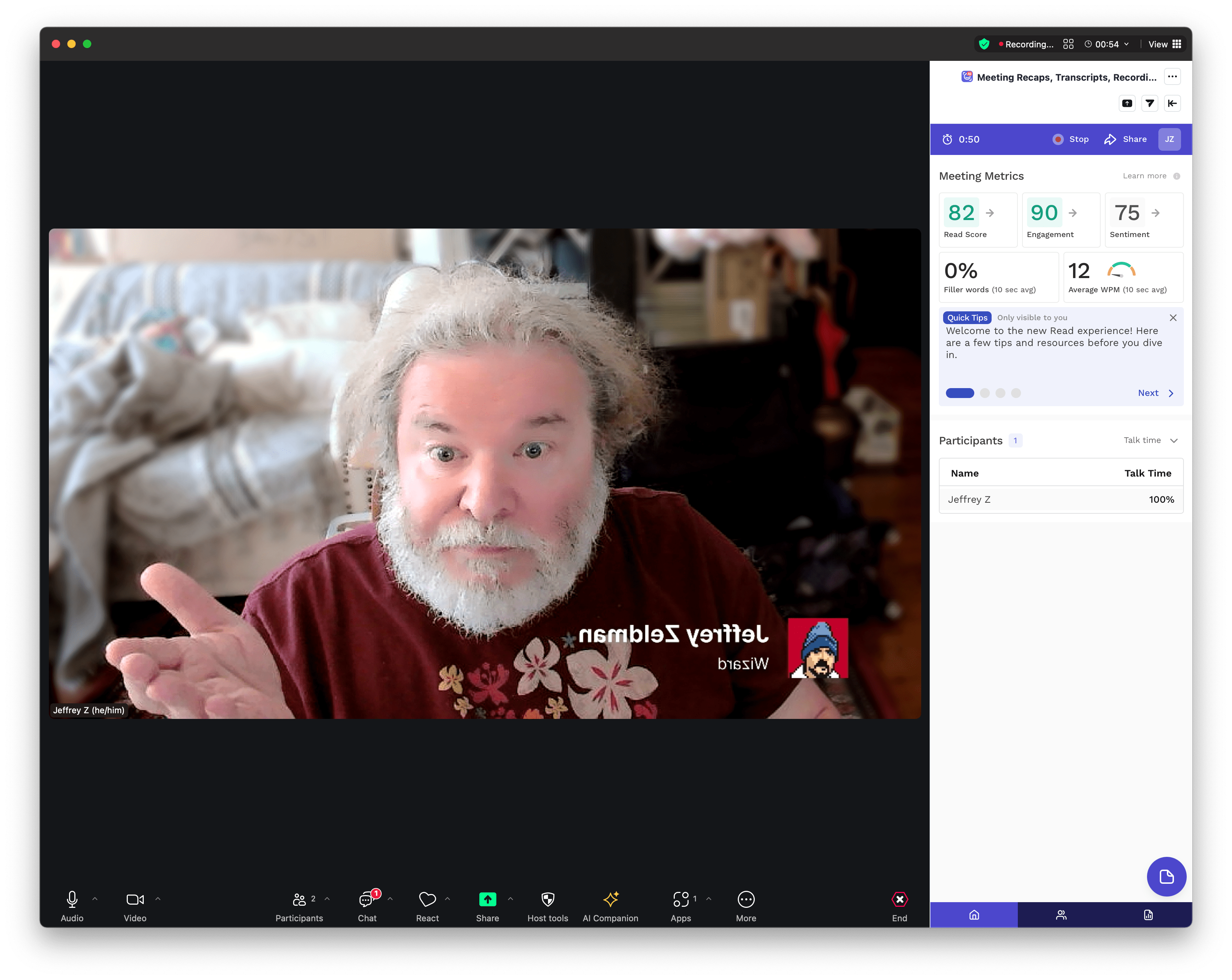
What happened to the Share button in Zoom?

Where did the button go? Jeffrey Zeldman can no longer find it.

Zoom has always included a clickable button/badge at the top left of its primary meeting interface window. Click the badge to copy the URL of that meeting. You can then, with just one more click in any messaging system, send that URL to the other meeting participants. Fast. Simple. Drop-dead easy. Elegant.

It comes in especially handy when people didn’t get (or didn’t see or for some reason can’t click on) the meeting link in their invite. Or when the meeting link is hidden behind a tab behind a tab behind a tab in their browser. Or for any of a dozen other reasons you might want to grab the URL of a meeting you’re in, and zap it to a colleague.

How wise are the designers of Zoom to have solved this problem!

And talk about usable! The button’s placement at the top left of the meeting window, with plenty of free open space around it, means that any user (regardless of software experience level) can quickly find the button when they needed it. It’s placed right where your eyes know to look for it.

Good design! Smartly focused on what’s most important to the user.

So, anyway, Zoom seems to have removed the button.

—As I discovered during a Zoom meeting with a colleague 30 minutes ago. (Or, more accurately, a Zoom meeting without that colleague.)

—Who texted me to request the Zoom URL. But I couldn’t send it to them. I couldn’t send it, because I couldn’t see it, because the interface was hiding it.

���Because Zoom has decided to remove that affordance, replacing it with… well, nothing, actually.

It is possible that the affordance still exists somewhere within the Zoom interface, in some gloomily cobwebbed, rarely visited subscreen or other. Possibly with a rewritten label, so that any Zoom customers lucky enough to find it will fail to recognize it, even if staring directly at it with the fixed gaze of an astronomer.

I don’t say Zoom has definitely removed one of the nicest (and possibly, in its humble way, most important) tools their product offered. I don’t say that because I can’t be sure. I merely say, if they haven’t removed this function, they might as well go ahead and do so, for all the good its hidden presence does for Zoom’s millions of users. If the tool is hidden somewhere in the deep background layers of Zoom, I sure couldn’t find it.

So, after wasting time hunting for and texting about the missing Zoom link affordance (here comes the punchline), my colleague and I ended up holding our Zoom call…

… in Google Meet.

If I were a Zoom executive or investor, this might worry me.


Offered with love, UX is hard, and not all decisions are in our hands.

Categories
Best practices business Career Design glamorous love My Back Pages The Old Man of the Mountain

One weird trick

They say you should manage down. You’re supposed to manage the people who work for you. For many people who become leads, it’s the toughest and least satisfying part of the job. This is especially true for people who become leads primarily because they’ve been on the job longer than the people around them—not because they had a management jones to satisfy.

They also say you should manage up—subtly assert control of the people you work for. Help them stop short of a bad idea and find their way to a better one. If you can manage up without being obvious about it, you just might save your job, your boss’s job, and your team’s work. 

And yet—

Management goes only so far.

The pains of managing up and down are better than the pains of not being able to manage at all. Further, if you swear by managing up or down, I’m not here to discredit you, nor would I dream of doing so, nor would I have cause.

But I am here today to ask you to also try thinking a different way.

Do keep helping people, whether you work for them, work with them, or they work for you.

But don’t think of it as managing them.

Think of it as helping a colleague, just as you’d help a friend, a family member, or (when you’re at your best, and when it’s safe) a stranger.

Help to help, because we’re built to help. We feel better when we do it.

Life is not a contest. At least, it doesn’t need to be chiefly or primarily a contest. If you request feedback and I provide it, what counts is that it helps you. Same when I ask for your help. My position versus yours within this particular hierarchy doesn’t matter. The ideas matter. And the best idea can come from anyone.

Hierarchy matters at times, sure. But not most of the time. Most of the time what matters is showing up, doing your work, and helping others do theirs. 

Have a better day!

Categories
Accessibility Adobe Advocacy AIGA art direction Authoring Bandwidth Best practices Browsers business Career client management Community creativity CSS Design Designers development Digital Preservation Fonts Future-Friendly HTML industry interface maturity Medium My Back Pages Off My Lawn! Performance Photoshop Rants Real type on the web Responsibility Responsive Web Design Site Optimization Standards State of the Web The Essentials The Profession Typography Usability User Experience UX Web Design Web Design History Web Standards Websites webtype work Working writing

This Web of Ours, Revisited

ONE MONTH and 24 years ago, in “Where Have All the Designers Gone?” (my HTMHell design column for Adobe of March 20, 2000), I discussed the deepening rift between aesthetically focused web designers and those primarily concerned with creating good experiences online:

More and more web designers seem less and less interested in web design.

Over the past 18 months or so, many of the best practitioners in the industry seem to have given up on the notion that a low-bandwidth, less than cutting-edge site is worth making. Much of the stuff they’ve been making instead has been beautiful and inspiring. But if top designers wash their hands of the rest of the Web, whose hands will build it, and whose minds will guide it? The possibilities are frightening.

An Imperfect Medium for Perfectionists

Why were many of the leading graphic designers and studios at the time uninterested in web design? For one thing, designers trained to strive for visual perfection found the web’s unpredictability depressing. The article provided clues to the frustrations of the time:

Good designers spend hours tweaking typography in Illustrator and Photoshop. Then visitors with slow connections turn off images.

Of course, where professionals trained in graphic design saw a distressing lack of control, others glimpsed in the infant technology a tremendous potential to help people, pixel-perfection be damned. To reduce the conflict to a cartoon, you might characterize it as David Carson versus Jakob Nielsen—though doing so would trivialize the concerns of both men. Designers already charged with creating websites found themselves somewhere in the middle—barking themselves hoarse reminding clients and managers that pixel-perfect rendering was not a thing on the web, while arguing with developers who told designers the exact same thing.

Visually inspiring websites like K10k showed that the web could, if approached carefully and joyfully, provide aesthetic delight. But many designers (along with organizations like AIGA) were unaware of those sites at the time.

Us and Them

Another source of tension in the medium in 2000 sprang from the discrepancy between the privileged access designers enjoyed—fast connections, up-to-date browsers and operating systems, high-res monitors (at least for the time) offering thousands of colors—versus the slow modems, aging and underpowered computers, outdated browsers, and limited-color monitors through which most people at the time experienced the web.

Which was the real design? The widescreen, multicolor, grid-based experience? Or the 216-color job with pixelated Windows type, a shallow “fold,” and pictures of headline text that took forever to be seen?

To view your masterpiece the way most users experienced it, and at the syrup-slow speed with which they experienced it, was to have an awakening or a nightmare—depending on your empathy quotient. Some designers began to take usability, accessibility, and performance seriously as part of their jobs; others fled for the predictability of more settled media (such as print).

A New (Old) Hope

My March, 2000 article ended on an upbeat note—and a gentle call to action:

For content sites to attain the credibility and usefulness of print magazines; for entertainment sites to truly entertain; for commerce sites and Web-based applications to function aesthetically as well as technically, the gifts of talented people are needed. We hope to see you among them.

That was my hope in 2000, and, all these years later, it remains my vision for this web of ours. For though the browsers, connections, and hardware have changed substantially over the past 24 years, and though the medium and its practitioners have, to a significant extent, grown the Hell up, beneath the surface, in 2024, many of these same attitudes and conflicts persist. We can do better.

Minus the framesets that formerly contained it, you may read the original text (complete with archaic instructions about 4.0 browsers and JavaScript that broke my heart, but which Adobe’s editors and producers insisted on posting) courtesy of the Wayback Machine.

☞  Hat tip to Andrey Taritsyn for digging up the article, which I had long forgotten.

Categories
apps Archiving art Design Illustration My Back Pages Web Design Web Design History

For love of pixels

Sure, watches that tell you when you’re walking unsteadily and pocket computer phones that show you the closest pizzeria are swell, but were you around for ResEdit? That humble yet supremely capable Macintosh resource editing tool is what we used to design pixel art back in the day. (And what day was that? Come August, it will be 30 years since the final release of ResEdit 2.1.3.) Stroll with us down memory lane as we celebrate the pearl anniversary of pixel art creation’s primary progenitor, and some of the many artists and design languages it inspired. Extra credit: When you finish your stroll, consider posting a Comment sharing your appreciation for this nearly forgotten art form and/or sharing links to additional pixel art icon treasures missing from our list below.

Categories
Authoring Best practices Blogs and Blogging Code Compatibility CSS Design development Free Advice Future-Friendly HTML industry Layout links maturity Off My Lawn! Platforms Rants Responsibility Standards State of the Web The Profession Web Design Web Design History Web Standards wisdom

The More Things Change… (or: What’s in a Job Title?)

I’m not a “[full-stack] developer,” regardless of what my last job title says.

I’m not even a front-end developer, thanks to the JavaScript–industrial complex.

I’m a front-of-the-front-end developer, but that’s too long.

So, I’m a web designer. And I also specialise in accessibility, design systems, and design.

…Why do I think that this is the best title? Here’s why.

I’m designing for the web. The infinitely flexible web. The web that doesn’t have one screen size, one browser, one operating system, or one device. The web that can be used by anyone, anywhere, on any internet connection, on any device, on any operating system, on any browser, with any screen size. I’m designing with the web. Using the web platform (HTML, CSS, JS, ARIA, etc.), not a bloated harmful abstraction. I have a deep understanding of HTML and its semantics. I love CSS, I know how and when to utilise its many features, and I keep up-to-date as more are added. I have a strong understanding of modern JavaScript and most importantly I know when not to use it.

Front-end development’s identity crisis by Elly Loel

See also:

The Wax and the Wane of the Web (2024): Forget death and taxes. The only certainty on the web is change. Ste Grainer takes a brief look at the history of the web and how it has been constantly reinvented. Then he explores where we are now, and how we can shape the future of the web for the better. – A List Apart

The Cult of the Complex (2018): If we wish to get back to the business of quietly improving people’s lives, one thoughtful interaction at a time, we must rid ourselves of the cult of the complex. Admitting the problem is the first step in solving it. – A List Apart

Dear AIGA, where are the web designers? (2007): For all the brand directors, creative directors, Jungian analysts, and print designers, one rather significant specimen of the profession is missing. – zeldman.com

Standardization and the Open Web (2015): How do web standards become, well, standard? Although they’re often formalized through official standards-making organizations, they can also emerge through popular practice among the developer community. If both sides don’t work together, we risk delaying implementation, stifling creativity, and losing ground to politics and paralysis. Jory Burson sheds light on the historical underpinnings of web standardization processes—and what that means for the future of the open web. – A List Apart

The profession that dare not speak its name (2007): “No one has tried to measure web design because web design has been a hidden profession.” – zeldman.com

Categories
A Book Apart A Feed Apart A List Apart An Event Apart Applications architecture Best practices Career client services Community conferences creativity CSS Design Designers Education eric meyer experience Formats glamorous Happy Cog™ Ideas industry Information architecture launches links maturity Mentoring Networks people social media social networking software Standards State of the Web Stories Teaching The Essentials The Profession twitter User Experience UX Web Design Web Design History wisdom

“Where the people are”

It’s nearly twenty years ago, now, children. Facebook had only recently burst the bounds of Harvard Yard. Twitter had just slipped the bonds of the digital underground. But web geeks like me still saw “social media” as a continuation of the older digital networks, protocols, listservs, and discussion forums we’d come up using, and not as the profound disruption that, partnered with smartphones and faster cellular networks, they would soon turn out to be. 

So when world-renowned CSS genius Eric Meyer and I, his plodding Dr Watson, envisioned adding a digital discussion component to our live front-end web design conference events, our first thought had been to create a bespoke one. We had already worked with a partner to adapt a framework he’d built for another client, and were considering whether to continue along that path or forge a new one.

And then, one day, I was talking to Louis Rosenfeld—the Prometheus of information architecture and founder of Rosenfeld Media. I told Lou about the quest Eric and I were on, to enhance An Event Apart with a private social network, and shared a roadblock we’d hit. And Lou said something brilliant that day. Something that would never have occurred to me. He said: “Why not use Facebook? It already exists, and that’s where the people are.”

The habit of building

Reader, in all my previous years as a web designer, I had always built from scratch or worked with partners who did so. Perhaps, because I ran a small design agency and my mental framework was client services, the habit of building was ingrained. 

After all, a chief reason clients came to us was because they needed something we could create and they could not. I had a preference for bespoke because it was designed to solve specific problems, which was (and is) the design business model as well as the justification for the profession. 

Our community web design conference had a brand that tied into the brand of our community web design magazine (and soon-to-emerge community web design book publishing house). All my assumptions and biases were primed for discovery, design, development, and endless ongoing experiments and improvements.

Use something that was already out there? And not just something, but a clunky walled garden with an embarrassing origin story as a hot-or-not variant cobbled together by an angry, virginal undergraduate? The very idea set off all my self-protective alarms.

A lesson in humility

Fortunately, on that day, I allowed a strong, simple idea to penetrate my big, beautiful wall of assumptions.

Fortunately, I listened to Lou. And brought the idea to Eric, who agreed.

The story is a bit more complicated than what I’ve just shared. More voices and inputs contributed to the thinking; some development work was done, and a prototype bespoke community was rolled out for our attendees’ pleasure. But ultimately, we followed Lou’s advice, creating a Facebook group because that’s where the people were. 

We also used Twitter, during its glory days (which coincided with our conference’s). And Flickr. Because those places are where the people were. 

And when you think about it, if people already know how to use one platform, and have demonstrated a preference for doing so, it can be wasteful of their time (not to mention arrogant) to expect them to learn another platform, simply because that one bears your logo.

Intersecting planes of simple yet powerful ideas

Of course, there are valid reasons not to use corporate social networks. Just as there are valid reasons to only use open source or free software. Or to not eat animals. But those real issues are not the drivers of this particular story. 

This particular story is about a smart friend slicing through a Gordian Knot (aka my convoluted mental model, constructed as a result of, and justification for, how I earned a living), and providing me with a life lesson whose wisdom I continue to hold close.

It’s a lesson that intersects with other moments of enlightenment, such as “Don’t tell people who they are or how they should feel; listen and believe when they tell you.” Meet people where they are. It’s a fundamental principle of good UX design. Like pave the cowpaths. Which is really the same thing. We take these ideas for granted, now.

But once, and not so long ago, there was a time. Not one brief shining moment that was known as Camelot. But a time when media was no longer one-to-many, and not yet many-to-many. A time when it was still possible for designers like me to think we knew best. 

I’m glad a friend knew better.

Afterword

I started telling this story to explain why I find myself posting, sometimes redundantly, to multiple social networks—including one that feels increasingly like Mordor. 

I go to them—even the one that breaks my heart—because, in this moment, they are where the people are. 

Of course, as often happens, when I begin to tell a story that I think is about one thing, I discover that it’s about something else entirely.