Categories
Advertising Collectibles Community content creativity Damned Fine Journalism Design Designers Desktops Digital Preservation Formats Free Advice glamorous HTML industry launches links music My Back Pages Own your content social media social networking software Surviving Tech Web Design Web Design History Web Standards Websites zeldman.com

My weekend project

It’s Sunday; I’m playing with my music collection, content as a fed-and-burped babe. Allow me to explain.

I realized last night that, in tracking my shifting musical tastes via my Last.fm Pro account, I’m basically remaking “Pardon My Icons,” the creative project I launched on this very website in 1995, back when it was still at a tilde address (it did not become zeldman.com until ’96), and which first brought my work to the attention of other creatives who were also discovering the early web and making it their own.

Me, collage, and music

Although I was not serious about it, I started making collage art when I lived in Washington DC in my 20s.

Back then I was serious about composing and producing. I used an Akai 12-track recorder, a rack of synth modules commanded by my Yamaha DX7 with a custom E! card, and a PC running Personal Composer MIDI, arranging, and composition software. I also had an old Selmer Bundy flute, an African reed instrument whose name I forget (and whose “reed” turned out to be a dried locust carcass, as I would discover, to my horror, when the instrument broke), Fender amps, mics, and a variety of percussion instruments with which I made music in my Washington, DC-based recording studio. But that’s a whole ’nother story.

I did not expect to earn a living as a composer, and in that negative expectation I was more than amply fulfilled.

So I scrounged up a day job at a local advertising agency as a naively optimistic copywriter.

And a night job as a stringer for The Washington Post’s Arts section.

Music journalist by night

The paper’s arts section editor in those days was named Richard. I’d gotten his attention without soliciting it after creating “Khz” for City Paper. Khz was my weekly music column. I covered the emerging go-go and hardcore scenes, as they were what was happening in DC, and the whole country would soon be listening. Naturally, the Post made me stop writing about that interesting and relevant stuff, and instead paid me $40 per to crank out anodyne concert reviews of mainstream artists like Kenny Rogers when their tours came through DC. (I was comped to the ticket but paid my own travel and gas out of the 40 bucks.)

I typically had 30 minutes from the time the headliner started to call in my review, which meant I had to write it in my head while watching the beginning of the performance, then run to a pay phone booth (kids, ask your parents) and dictate it aloud to someone on the copy desk, before the concert had even begun to build up a head of steam. This wasn’t fair to the artists. I did the best job I could under the circumstances, taking pride in how quickly I could structure and ship a news story. Richard fired me before I could quit, but that, too, is another story.

Most importantly at that time, I lived with a girlfriend. She was an artist and architect who had left that career to study computer programming. We were social (many friends, drinking was often involved), and serious about our art—which, in my case, was music, even if I earned my living writing concert reviews and crafting passable but hardly brilliant ads.

Through all of those ups and downs, and to the side of those major efforts, I kept at the collage for years, putting in several hours a night making the things. When each was finished—and deciding that any art product was finished was damned tough for my restless young mind—I would carefully frame it behind glass, and mount it on the walls of our apartment.

Was it art? Just a hobby? Who knows? It made me happy.

And then gradually, as I put more effort into my music and ad careers, I set the collage-making aside, for a time.

New career in a new town

Ten years later, I was a New York art director and copywriter, two years sober, and no longer in that same romantic relationship. That’s okay, I was in a new one.

I’d packed my music studio equipment—now obsolete because Akai stopped making the proprietary multitrack tape format that their 12-track unit ran on—in a storage unit. Eventually I’d give away all that music and recording equipment (keeping only the multitrack masters), but that, too, is another story.

Cutting-edge for a day

Then in 1995, one of our ad clients asked the agency if we could make them a website. Like many of you, we lied and said, sure. And then we figured out how to actually do it.

The client was Warner Bros., the project was “Batman Forever,” our visionary client was Donald Buckley, my partners were Steve McCarron, Alec Pollak, and Doug Rice, and the website was a huge hit, attracting half the people who visited the early web. (Alec’s “Flashback 1995: batmanforever” shares screenshots, which are great, although they cannot convey what a breakthrough the site was in March, 1995.)

With 3 million people using the web in 1995, the site got 1.5 million visits a day for over a year. Not bad.

Pardon my icons (1995)

First gallery spread of “Pardon My Icons,” a zeldman.com entertainment from 1995 ff.

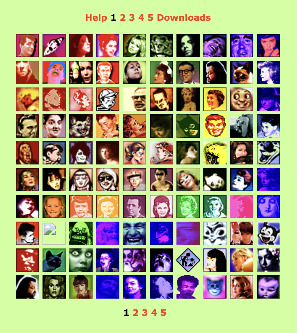
I immediately set to work creating a personal site (this one), and Pardon My Icons was one of its first “entertainments.”

As is often the case with my creative efforts, I made these tiny, Warhol-inflected bits of art as a protest against what I saw as the mediocrity of the icons in general use on that early, early web.

(Similarly, my friends and I would later start The Web Standards Project in protest against the dumb ways most folks were being told to create websites, e.g. using proprietary tags instead of W3C and ECMA standards, because browsers didn’t properly support those. Having lost access to my musical master tapes because I’d invested in Akai’s non-standard and eventually discontinued tape format, I was kind of keen on not letting the internet fall victim to the same kind of nonstandard f*ckery. But that, too, is another story. We are gathered here to talk about icons and collage. So let’s do that:)

A mental break

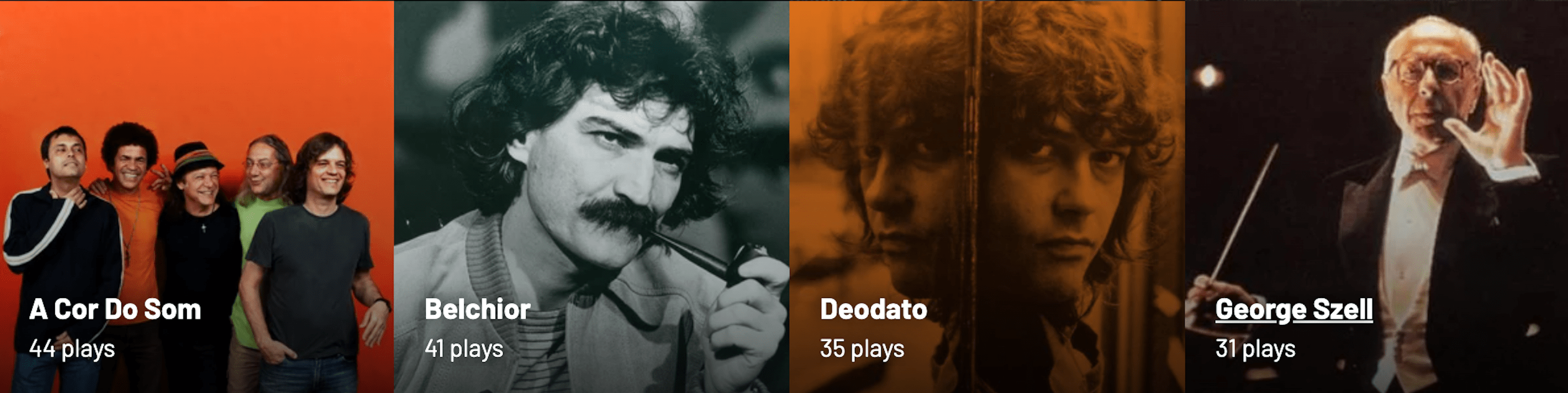
I track my music on Last.fm Pro. Here’s my account. (But don’t look unless you, too, have a Pro account. I’ll explain why in a moment.)

Photo spread: some of the artists I listen to, as shown on last.fm Pro.
Some of the artists I listen to, as shown on last.fm Pro.

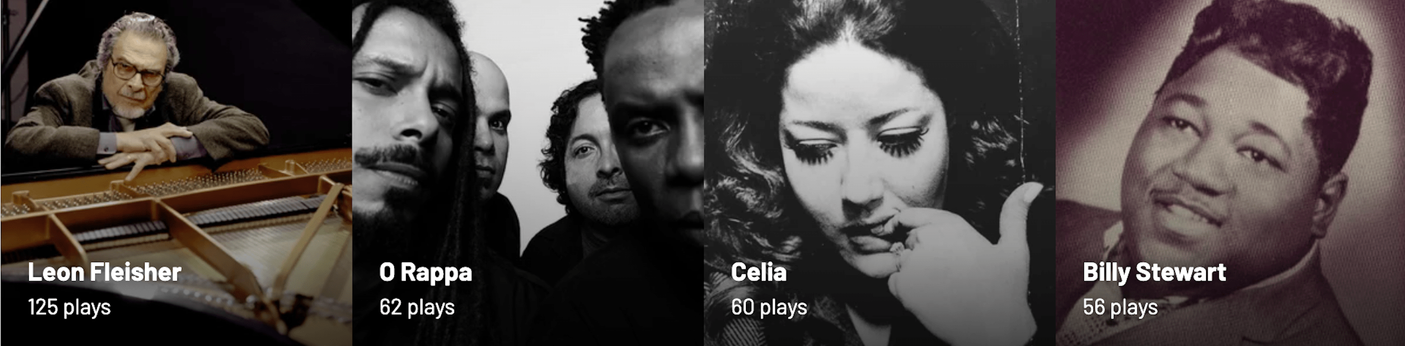
Last.fm lists the artists you play, arranging them by the number of plays. Thus, if you were to play three tracks by Freddie Gibbs and two by Bill Evans, you’d have a collage featuring those two artists, with Freddie preceding Bill because he has one more play than Bill.

But if you play three tracks each of Freddie Gibbs and Bill Evans, then Bill will come first, because Bill comes before Freddie alphabetically.

Through such moves, over time, an ever-shifting collage unfolds. But only in Last.fm Pro.

In regular, free old last.fm, you can see other people’s artists as a list, arranged by number of plays, interrupted by an ugly barrage of ads. This is a useful free service for those who are curious about what their friends listen to. But it is a list, not an artful collage, of course.

Collage for days

In Pro, you can see their artists and yours as an ad-free collage that goes on for pages and pages. Plus, as a Pro user, you can choose which photo represents which artist—and even upload your own. When viewing your collection, you and your visitors will see a collage of your favorite artists, in descending order of plays (and with the English alphabet deciding who at each play count precedes whom), using artwork you not only select, but you can also create and upload to the service.

I like Pro. And even though the product isn’t exactly in what you’d call hyper active development—even though the server isn’t always fast, even though there are a few bugs that will probably never get fixed, even though new features are introduced rarely, and the company’s customer service department isn’t exactly the most active help desk in tech—despite those minor drawbacks, the site does things no other website can do. And at US $3, the Pro account isn’t exactly priced out of reach for most customers. (If you can afford a computer, internet access, a music collection and/or a music streaming service, you can probably scratch the 3 bucks together as well.)

How to collage on last.fm

By controlling what I listen to, and the order in which I listen, I’m slowly building an infinite collage of my evolving musical tastes.

By choosing or finding the artist photos (often post-producing them in Photoshop), I create my mood, my rhythm, and my shifting color palettes.

There are design rules governing where portraits should be placed. For instance, people whose face or gaze points rightward get placed on the left of the grid, so they lead the viewer’s eye from left to right, into the composition, whereas those who gaze to my left belong on the right side, leading the viewer’s eye back in.

To reposition someone, I may listen to a few extra plays of them. Or use last.fm’s Pro Admin to subtract a few plays.

When I started using Last.fm, I merely wanted a visual record of what I was listening to, and when I listened. But as you may have inferred, an accurate count of everything I’ve listened to over the past years is no longer my goal in using last.fm; the goal is now the endless collage.

It’s kinda spiritual.

(Reminder: the only way to see it is to be a Pro member of last.fm, which turns off ads and enables you to view your own and other people’s collections in a grid format instead of a list. If you’re a non-member, you see a list jammed with ads.)

If a tree falls, is it art?

Unlike the real-world collages I made in my 20s (which could be mounted on a wall), and unlike 1995’s “Pardon My Icons” (which could be viewed in any browser connected to the web), my current art-making/hobby activity is not publicly viewable except by last.fm Pro users. And that’s okay. ’Cause I’m not designing this for anyone besides myself to enjoy. I mean, if you see it, cool. But if nobody ever sees it, engaging with it will still make me happy.

Which makes this collage business—what? Therapy? Gaming? (Just of a different sort than anybody else?) A form of stimming? It definitely helps lower my general anxiety, providing a space where I can make pretty pictures while listening to my favorite music, which, driven in part by the desire to expand the collage, is widely inclusive and always expanding.

The hunt for fresh collage material also helps keep me interested in new music. (Readers who feel stuck, take note.) And my collage-making, however unimportant it may be, also provides a needed mental health break during these hellish times.

I do this activity every weekend when my more normal friends are biking or baking or dancing.

Is this activity, into which I’ve now poured many hours of my life, artistry or autism? Who cares? The point is that it’s escapist and harmless and we all need some of that in our lives, however we can grab it.

However you grab your moments of calm, meditation, and happiness, never be ashamed of taking care of yourself.

See also…

Rediscovering music: If Spotify exposes you to new music other people are listening to, Last.fm helps remind you of great music in your existing collection that may have slipped your mind.

For love of pixels: Stroll with us down memory lane as we celebrate the pearl anniversary of pixel art creation’s primary progenitor, and some of the many artists and design languages it inspired.

Categories
37signals A Book Apart A List Apart Acclaim Adobe An Event Apart books Brands business Career Collectibles Community conferences content Coudal Partners Deck, the Designers E-Books editorial eric meyer Ethan Marcotte Free Advice glamorous Grief Happy Cog™ HTML5 Indieweb industry Jason Santa Maria Jeremy Keith launches Mentoring My Back Pages New York City NYC Products Publications Publisher's Note Publishing Responsibility Responsive Web Design San Francisco Small Business speaking State of the Web Surviving The Essentials The Profession This never happens to Gruber Typekit User Experience UX Wah! Web Design Web Design History Websites Wit and Wisdom Working writing zeldman.com

Of Books and Conferences Past

Some of A Book Apart’s 50-odd primary paperbacks, arranged like a color spectrum, and photographed against a piece of wood.

Just as nobody who marries spends their wedding day planning their divorce, almost nobody starts a business contemplating what rocks it will eventually splinter and break upon, and how to build a life raft for themselves.

I take that back. Some folks I know, who played pivotal roles in the evolution of the web, actually started their businesses with a clear goal of selling them to somebody bigger. Like Typekit was designed to sell to Adobe. Or Blogger was designed to sell to Google.

Such folks, several of whom are now post-economy wealthy, lived in the Bay Area in the 1990s and early 2000s, where building to flip was widely discussed and accepted.

Meanwhile, in NYC…

I, on the other hand, live in New York. So I started my web businesses (like Happy Cog™ design studio) to serve clients, as NYC creatives have always done, and with no understanding that I would one day need to leave the company and should have an exit plan. Why would I exit? Why would I ever stop doing work that brought excitement and meaning to my life?

Similarly, I started my personal site with its “Ask Dr. Web” tutorials in 1995, and co-founded my web design publication, A List Apart, in 1997, for the sheer joy of sharing knowledge, with no concept of making money, let alone of one day selling the business.

Eventually, despite my naivete, and mostly thanks to Jim Coudal and Jason Fried, A List Apart began making money by running one carefully screened ad per page. I used that money, as you will expect, to pay our writers, editors, and producers. And when it came time to stop running ads, I slowed our publication schedule, paid writers out of my own pocket, and worked with a small crew of fellow volunteers, who published ALA because we believed in the mission. (Still do.)

If I had come of business age in San Francisco, I likely would have sold A List Apart to somebody like O’Reilly, but that was never my plan because I make toys to play with, not to give away.

An ecosystem apart

In spite of A List Apart’s running at a loss, in the early 2010s I co-founded two businesses that spun out of it: An Event Apart design conference with Eric Meyer, and A Book Apart with Mandy Brown (later replaced by CEO Katel LeDu) and Jason Santa Maria. And during those first years, business was great.

We published HTML5 For Web Designers the day after Steve Jobs, waving an iPhone on the world’s biggest stage (okay, sitting at his desk), announced that Flash was dead because HTML5 would bring app-like dynamism to the web using open standards instead of proprietary code. It (our first book, I mean) sold brilliantly. “Gee, publishing isn’t that hard” I naively told myself. (No, I knew it was hard. My favorite publishers had been laying off my favorite editors for ten years before my partners and I took the plunge. But the early success did make me think the books we published about web design would always find a large, eager audience. In time, I would learn otherwise.)

And while we began the publishing house by relying on the best writers we knew personally to write about the topics they were most passionate about, I’m proud to say that, as we went along, we also discovered brilliant first-time book authors, helping them create perfectly polished, fluff-free manuscripts that made genuine contributions to our readers’ understanding of UX and all it entails. (And not just to our readers. The insights they brought to their work after digesting our books rubbed off on their colleagues.)

In giving these brilliant writers a platform, we not only helped them take their careers to the next level, we also helped people who create web content think and work better, which in turn helped the people who used the websites, applications, and products our readers designed and built. Of that, I am proud.

Stay hungry

An Event Apart (RIP) was also a damned fine early success. Web designers liked our innovation of a multi-day, single-track conference, with a holistic approach to web design, code, and content, and unifying themes between the individual talks. Our freaking-amazing speakers debuted Huge Ideas including Mobile First and Responsive Web Design—ideas which, like perfect contextual menus in UX, arrived at the very moment designers needed them.

Not only that, but these humble geniuses also sat in the auditorium with our audience for all three days of each conference event: listening to each other’s presentations, and updating their own presentations to better bounce off each other’s ideas and the evolving themes of that particular show. 

I could spend hours telling you how our producer Toby M. made miracles happen at every show, or how person-in-charge Marci E. brought joy to our community. How many of our speakers became authors. How some “graduated” from An Event Apart as newcomers replaced them. How the diversity of our speaking line-up, which wasn’t terrific in 2008, improved greatly each year. (Not that we ever said, “We need another black speaker” or “We need a trans speaker” or what-have-you. Just that we learned to swim outside the pool we came from, and discover great talent everywhere.) Our speakers were also almost uniformly Just Nice Good People, which doesn’t always happen when you’re collecting the greatest minds in an industry. 

That’s not even to mention the incredible people who attended our shows, some of whom became lifetime friends for me.

So why, given the joy these businesses brought to everyone connected to them, including me, would my partners and I have even conceived of an exit strategy? We wanted the Good Times to roll on forever.

But of course they never do.

Things end

COVID did in An Event Apart. Some conferences survived, of course. Different priorities, different overheads, different business models. Some that survived do not pay their speakers. Others, where the conference is an adjunct to a bigger business, laid off or reassigned conference staff while the pandemic made live events impossible. Others that survived mostly rely on volunteer labor, whereas we had paid staff. They were worth their weight in platinum, and we’d have paid them more (because they were worth more) if the pandemic and six-figure hotel contracts hadn’t made continuing the show impossible. My partner and I earned nothing during the business’s last five years, and got personally stuck with a six-figure debt when the event closed. It is what it is.

Although books should be COVID-proof, multiple financial problems eventually beset our publishing house as well. For most of the run of the business, my partner and I earned nothing beyond the glow of contributing to our community’s knowledge. We paid our CEO, authors, and editors, kept nothing for ourselves, and tried, oh how we tried, to keep the business going as its revenues tanked.

Speaking only for myself, I’ve learned that I am good at starting businesses and keeping them going creatively, as long as somebody else figures out the money. I suck at that, and I’m obsessed with the notions of fairness and self-sacrifice that were drummed into me by a narcissistic family that valued me for taking on the roles they were emotionally incapable of handling—such as bringing up my baby brother in my father’s absence, which no child is  equipped or should be asked to do, and yet it happens all the time. Growing up this way made me put my own self-interest last. Which is also why it never occurred to me to plan an exit. And by the time I needed to do so, the businesses were not in shape to sell.

Closing a conference is bad, but attendees can go to other conferences, and speakers can speak at other conferences; closing a conference doesn’t end a community. It sucks for the business but doesn’t strand participants.

But closing a publishing house hurts like hell, and you feel you let everybody down. I know how much our closing hurt some of our authors, and I think about that, instead of the good we achieved, when I look back. 

No doubt when my partner and I write the large personal checks to cover our deceased business’s outstanding debts, we’ll be regretting the harm our closing caused, not basking in the warm glow of how many careers we changed for the better. Like the standup comedian who obsesses about the guy who’s frowning at table 3, and doesn’t hear the laughter of the rest of the crowd. We also, hopefully, won’t focus too closely on our financial wreckage. Just pay the bill, and move on.

Anyway, I hadn’t publicly addressed the endings of these businesses, so I figured it was time to do so. I’m sharing my experience only. If you ask any of the people I worked with on these projects, they might have a different story to tell. And that would be their story, and it would be every bit as valid as anything I’ve said here.

I also didn’t ask permission of my partners, speakers, or authors before sharing these thoughts. Probably I should have. But, hey. As I’ve said. I’m speaking here only for myself.

So, anyway.

Parting gift

Is it worth the risk of starting a web-related business that isn’t a venture-backed startup? I still think it is, and I applaud all who try. Heck, I might even do so myself someday. If you’re doubtful because of (((gestures at everything))), it might be worth noting that I started Happy Cog™ during the dot-com crash, when studios were closing all around me. And we launched A Book Apart during the world financial crisis of late 2008. Don’t let (((all this))) deter you from trying something bold. Let me know when you do. I’ll keep watching the skies.

P.S. Under swell third-party ownership and management, Happy Cog is still going strong. Check it out!

Categories
"Digital Curation" A List Apart Acclaim Designers development Publications social media social networking Web Design Web Design History Web Standards Websites writing

A List Apart contributors list on Bluesky

I’ve started a Bluesky list featuring some of the brilliant writers, designers, coders, editors, and others who’ve contributed to A List Apart “for people who make websites” from the magazine’s first dawning back in the 19(mumbles). Bluesky fans, grab the list here:

https://bsky.app/profile/did:plc:pgjpl4opnmqxxpb74n4vuabv/lists/3lbozpqe2kq2t

Why only *some* of the contributors? Simple. Several are, sadly, deceased. Many others are likely alive and well but not yet on Bluesky. We can’t unmake death, but we can offer the living networked comradeship and a wee increase in visibility.

So if you’re an A List Apart contributor who’s been thinking of joining Bluesky, consider this an incentive. Note: I’m not a partner in Bluesky, and have nothing to gain from inviting you, beyond the pleasure of your company—be it salty or sweet.

Once you join and have started a profile, ping me and I’ll add you to the list. (I’m zeldman.bsky.social on Bluesky.)

And, hey, if you haven’t yet contributed to A List Apart, your ideas are always welcome.

Online since 1998, A List Apart (ISSN: 1534-0295) explores the design, development, and meaning of web content, with a special focus on web standards and best practices. About the magazine. | Complete list of Authors. | Style Guide. Cheers!

Open-source moderation

“Our online experience doesn’t have to depend on billionaires unilaterally making decisions over what we see.”

Category: A List Apart

From pixels to prose, coding to content.

In search of a digital town square

A personal assessment from February, 2024 of the fractured social network landscape.

Categories
"Digital Curation" Acclaim art direction creativity CSS Design Designers Ideas IXD Layout links mobile State of the Web Typography User Experience UX Web Design Web Design History Websites

Web Design Inspiration

If you’re finding today a bit stressful for some reason, grab a respite by sinking into any of these web design inspiration websites.

Gathered from conversations on Reddit and elsewhere, each site offers a collection of other sites’ designs, chosen for impact, originality, and innovation. Each collection should offer at least a few designs that will inspire your own ideas and creativity—and most contain more than a few. Lots more.

We make no claims as to usability, accessibility, or appropriateness of design. Which doesn’t mean that the chosen websites are unusable, inaccessible, or inappropriate to the brand, subject matter, or needs of the audience. Indeed, from the care devoted to the graphical interface, we assume that many of these sites are as good under the hood as they are on the surface. But it’s just an assumption; we haven’t tested, and the point of this post is purely to share visual and creative inspiration. Enjoy!

And for dessert…

Enjoy https://betteroff.studio/, an individual studio’s rhythmically organized, sensory-appealing design.

Categories
Designers

Designer Jonathan Lee

Categories
Accessibility Adobe Advocacy AIGA art direction Authoring Bandwidth Best practices Browsers business Career client management Community creativity CSS Design Designers development Digital Preservation Fonts Future-Friendly HTML industry interface maturity Medium My Back Pages Off My Lawn! Performance Photoshop Rants Real type on the web Responsibility Responsive Web Design Site Optimization Standards State of the Web The Essentials The Profession Typography Usability User Experience UX Web Design Web Design History Web Standards Websites webtype work Working writing

This Web of Ours, Revisited

ONE MONTH and 24 years ago, in “Where Have All the Designers Gone?” (my HTMHell design column for Adobe of March 20, 2000), I discussed the deepening rift between aesthetically focused web designers and those primarily concerned with creating good experiences online:

More and more web designers seem less and less interested in web design.

Over the past 18 months or so, many of the best practitioners in the industry seem to have given up on the notion that a low-bandwidth, less than cutting-edge site is worth making. Much of the stuff they’ve been making instead has been beautiful and inspiring. But if top designers wash their hands of the rest of the Web, whose hands will build it, and whose minds will guide it? The possibilities are frightening.

An Imperfect Medium for Perfectionists

Why were many of the leading graphic designers and studios at the time uninterested in web design? For one thing, designers trained to strive for visual perfection found the web’s unpredictability depressing. The article provided clues to the frustrations of the time:

Good designers spend hours tweaking typography in Illustrator and Photoshop. Then visitors with slow connections turn off images.

Of course, where professionals trained in graphic design saw a distressing lack of control, others glimpsed in the infant technology a tremendous potential to help people, pixel-perfection be damned. To reduce the conflict to a cartoon, you might characterize it as David Carson versus Jakob Nielsen—though doing so would trivialize the concerns of both men. Designers already charged with creating websites found themselves somewhere in the middle—barking themselves hoarse reminding clients and managers that pixel-perfect rendering was not a thing on the web, while arguing with developers who told designers the exact same thing.

Visually inspiring websites like K10k showed that the web could, if approached carefully and joyfully, provide aesthetic delight. But many designers (along with organizations like AIGA) were unaware of those sites at the time.

Us and Them

Another source of tension in the medium in 2000 sprang from the discrepancy between the privileged access designers enjoyed—fast connections, up-to-date browsers and operating systems, high-res monitors (at least for the time) offering thousands of colors—versus the slow modems, aging and underpowered computers, outdated browsers, and limited-color monitors through which most people at the time experienced the web.

Which was the real design? The widescreen, multicolor, grid-based experience? Or the 216-color job with pixelated Windows type, a shallow “fold,” and pictures of headline text that took forever to be seen?

To view your masterpiece the way most users experienced it, and at the syrup-slow speed with which they experienced it, was to have an awakening or a nightmare—depending on your empathy quotient. Some designers began to take usability, accessibility, and performance seriously as part of their jobs; others fled for the predictability of more settled media (such as print).

A New (Old) Hope

My March, 2000 article ended on an upbeat note—and a gentle call to action:

For content sites to attain the credibility and usefulness of print magazines; for entertainment sites to truly entertain; for commerce sites and Web-based applications to function aesthetically as well as technically, the gifts of talented people are needed. We hope to see you among them.

That was my hope in 2000, and, all these years later, it remains my vision for this web of ours. For though the browsers, connections, and hardware have changed substantially over the past 24 years, and though the medium and its practitioners have, to a significant extent, grown the Hell up, beneath the surface, in 2024, many of these same attitudes and conflicts persist. We can do better.

Minus the framesets that formerly contained it, you may read the original text (complete with archaic instructions about 4.0 browsers and JavaScript that broke my heart, but which Adobe’s editors and producers insisted on posting) courtesy of the Wayback Machine.

☞  Hat tip to Andrey Taritsyn for digging up the article, which I had long forgotten.

Categories
A Book Apart A Feed Apart A List Apart An Event Apart Applications architecture Best practices Career client services Community conferences creativity CSS Design Designers Education eric meyer experience Formats glamorous Happy Cog™ Ideas industry Information architecture launches links maturity Mentoring Networks people social media social networking software Standards State of the Web Stories Teaching The Essentials The Profession twitter User Experience UX Web Design Web Design History wisdom

“Where the people are”

It’s nearly twenty years ago, now, children. Facebook had only recently burst the bounds of Harvard Yard. Twitter had just slipped the bonds of the digital underground. But web geeks like me still saw “social media” as a continuation of the older digital networks, protocols, listservs, and discussion forums we’d come up using, and not as the profound disruption that, partnered with smartphones and faster cellular networks, they would soon turn out to be. 

So when world-renowned CSS genius Eric Meyer and I, his plodding Dr Watson, envisioned adding a digital discussion component to our live front-end web design conference events, our first thought had been to create a bespoke one. We had already worked with a partner to adapt a framework he’d built for another client, and were considering whether to continue along that path or forge a new one.

And then, one day, I was talking to Louis Rosenfeld—the Prometheus of information architecture and founder of Rosenfeld Media. I told Lou about the quest Eric and I were on, to enhance An Event Apart with a private social network, and shared a roadblock we’d hit. And Lou said something brilliant that day. Something that would never have occurred to me. He said: “Why not use Facebook? It already exists, and that’s where the people are.”

The habit of building

Reader, in all my previous years as a web designer, I had always built from scratch or worked with partners who did so. Perhaps, because I ran a small design agency and my mental framework was client services, the habit of building was ingrained. 

After all, a chief reason clients came to us was because they needed something we could create and they could not. I had a preference for bespoke because it was designed to solve specific problems, which was (and is) the design business model as well as the justification for the profession. 

Our community web design conference had a brand that tied into the brand of our community web design magazine (and soon-to-emerge community web design book publishing house). All my assumptions and biases were primed for discovery, design, development, and endless ongoing experiments and improvements.

Use something that was already out there? And not just something, but a clunky walled garden with an embarrassing origin story as a hot-or-not variant cobbled together by an angry, virginal undergraduate? The very idea set off all my self-protective alarms.

A lesson in humility

Fortunately, on that day, I allowed a strong, simple idea to penetrate my big, beautiful wall of assumptions.

Fortunately, I listened to Lou. And brought the idea to Eric, who agreed.

The story is a bit more complicated than what I’ve just shared. More voices and inputs contributed to the thinking; some development work was done, and a prototype bespoke community was rolled out for our attendees’ pleasure. But ultimately, we followed Lou’s advice, creating a Facebook group because that’s where the people were. 

We also used Twitter, during its glory days (which coincided with our conference’s). And Flickr. Because those places are where the people were. 

And when you think about it, if people already know how to use one platform, and have demonstrated a preference for doing so, it can be wasteful of their time (not to mention arrogant) to expect them to learn another platform, simply because that one bears your logo.

Intersecting planes of simple yet powerful ideas

Of course, there are valid reasons not to use corporate social networks. Just as there are valid reasons to only use open source or free software. Or to not eat animals. But those real issues are not the drivers of this particular story. 

This particular story is about a smart friend slicing through a Gordian Knot (aka my convoluted mental model, constructed as a result of, and justification for, how I earned a living), and providing me with a life lesson whose wisdom I continue to hold close.

It’s a lesson that intersects with other moments of enlightenment, such as “Don’t tell people who they are or how they should feel; listen and believe when they tell you.” Meet people where they are. It’s a fundamental principle of good UX design. Like pave the cowpaths. Which is really the same thing. We take these ideas for granted, now.

But once, and not so long ago, there was a time. Not one brief shining moment that was known as Camelot. But a time when media was no longer one-to-many, and not yet many-to-many. A time when it was still possible for designers like me to think we knew best. 

I’m glad a friend knew better.

Afterword

I started telling this story to explain why I find myself posting, sometimes redundantly, to multiple social networks—including one that feels increasingly like Mordor. 

I go to them—even the one that breaks my heart—because, in this moment, they are where the people are. 

Of course, as often happens, when I begin to tell a story that I think is about one thing, I discover that it’s about something else entirely.

Categories
A List Apart Career Community Coudal Partners creativity Design Designers glamorous Happy Cog™ Indieweb links Mentoring Off My Lawn! Products Small Business social media State of the Web User Experience UX Web Design History wisdom

Fly, my designers, fly!

Designers can either become drivers of business within their organizations, or they can create the businesses they want to drive. We’re entering an era of design entrepreneurship, in which some designers are realizing that they’re not just a designer employed by a business; they’re creative business people whose skill set is design.

The State of UX in 2024

The quotation above is from a report at trends.uxdesign.cc subtitled “Enter Late-Stage UX.” It is an important thought. And if it seems like a new one to designers in their first decade of work, it will feel quite familiar to to those of us who earned our merit badges during the 1990s and 2000s. See, for instance,

When You Are Your Own Client, Who Are You Going To Make Fun Of At The Bar?

by Jim Coudal (2005),

Starting a Business: Advice from the Trenches

by Kevin Potts (2003), and

THIS WEB BUSINESS, Part One

by Scott Kramer (2000, one of four terrific ALA articles by Scott on that subject).

That widespread, intoxicating entrepreneurial impulse led to a cornucopia of internet content and products (and, eventually, “real-world” products, too). Some flopped. Some flowered for a magical season (or twelve), and then faded as times and the market changed. Some grew and grew, growing communities with them. A few changed the world, for better or worse. (And, occasionally, for both.)

History repeats, but it also changes. If flying from your corporate perch feels like your best response to an industry where the idealism that led you to UX feels somewhat beside the point, go for it! —But first, check your bank balance, and talk with family, friends, and a business advisor, if you have one.

Trusting my ability to use design and words to say something original enabled me to work for myself (and with partners) from 1999–2019, and it was good. Financially, running independent businesses is a perpetual rollercoaster, and it can crush your soul if your beloved creation fails to connect with a community. Some people exit rich. Others just exit. “Don’t burn any bridges” is a cliché that exists for a reason. But I digress.

“Consider entrepreneurship” is but one piece of useful advice in this year’s excellent State of UX report by Fabricio Teixeira and Caio Braga, with deeply clever illustrations by Fabio Benê and significant contributions from Emily Curtin (God bless the editors!) and Laura Vandiver.

I invite you to read and bookmark the whole thing. I plan to reread it several times myself over the next weeks. It’s that deep, and that good. Hat tip to my colleague Jill Quek for sharing it.

Read: The State of UX in 2024.

Categories
art art direction creativity Design Designers experience Illustration industry New York City NYC people Portfolios Startups Stories Web Design

Looking Back, Looking Ahead: artist Dan Licht

Illustration by Dan Licht: a scary cowboy smoking a stogie and sloshing his drink. His eyes are red and he looks like he's itching for a fight.
Illustration by Dan Licht
Illustration by Dan Licht.

In 1999, I had the good fortune to work alongside Dan Licht at an NYC digital startup called SenseNet, RIP. Back then, although still in his early 20s, Dan was already an accomplished art director and digital designer. Today he’s a fantastic comics illustrator, artist, and creative director. Check his recent art on Instagram and his client work at Daniel V. Licht dot com.

A heroic letter carrier is pictured sending letters on their way in this illustration by Dan Licht. The picture has a great deal of energy, and the action is all flying toward you, the viewer.
“Protect the U.S. Postal Service,” a 2020 illustration by Dan Licht.
Categories
An Event Apart Appearances art direction better-know-a-speaker books Career conferences Design Designers Education events Genius glamorous Illustration industry Interviews New York City NYC Off My Lawn! speaking Stories Surviving Teaching The Profession UX Web Design Web Design History work

My Night With Essl

Mike Essl and I discuss his portfolio.
Mike Essl and I discuss his portfolio on Night 2 of An Event Apart Online Together Fall Summit.

Herewith, a scene from last night’s interview with legendary web & book designer (and Dean of The Cooper Union School of Art) Mike Essl, who shared his portfolio, career highlights, early web design history, and more. Fun!

If you get a chance to meet, work with, or learn from Mike, take it. He’s brilliant, hilarious, warmly human, and one of the most creative people you’ll ever have the good fortune to know. 

Mike Essl

So ended Day 2 of An Event Apart Online Together Fall Summit 2021. Day 3 begins in less than two hours. You can still join us … or watch later On Demand.

Categories
Designers Ideas industry Interviews links people podcasts User Experience UX Web Design work

Amplifying voices

Some of the interviewees of the Technically Speaking podcast.

New episodes of Harrison Wheeler’s Technically Speaking podcast are coming, and Technically Speaking will run live interviews at San Francisco Design Week June 7–13. 

The podcast amplifies voices of underrepresented leaders who want to inspire the next generation of black and brown designers through authentic, thought-provoking, and immersive storytelling. 

Learn more on the podcast’s homepage, listen to past episodes, and sign up for the newsletter to be notified about upcoming content. 

Categories
Advertising Best practices Career creativity Design Designers glamorous links work Working

Never give up

This story is a bit long, but I promise it will be worth it, because it contains the two most important principles every designer must know and take to heart if you intend to do great work anywhere, under almost any circumstances, over the long, long haul of your career.

Sticking To It – fresh from JZ in Automattic.Design
Categories
Design Designers Platforms Real type on the web software State of the Web

Pro Fonts for iPad

Fontstand has just launched an iPad app that designers (or anyone else) install third-party fonts on iPad. For a small fee, anyone can use thousands of high-quality fonts, directly from the designers. Its creators say:

We imagine that creative professionals and design enthusiasts will take advantage of the advanced possibilities of iPad to create their presentations, documents and graphics directly on the tablet, without the need to migrate projects across platforms.

Fontstand blog

Created by Andrej Krátky and Peter Bilak (also a founder of Typotheque), Fontstand is a font discovery platform that lets folks test and use high-quality fonts on all platforms.

Read all about it and download the app for free: blog.fontstand.com/

Categories
Design Designers Digital Preservation My Back Pages State of the Web Web Design History

The Web We Lost: Volume One

I don’t miss Flash but I sure miss this level of creativity and experimentation on the web. As today’s “The Web We’ve Lost” exercise for designers, please take a look back at Matt Owens’s historic Volume One project—outstanding design work Matt created in Flash during the 1990s and early 2000s, now memorialized in screenshots. Enjoy:

volumeone.com

For more about Matt, read “From Technology to Commodity – Then and Now,” a brief history of Matt’s 25 years as an independent designer. Matt currently works at Athletics, an award-winning Brooklyn-based design agency he co-founded.

Categories
Advocacy art direction Design Designers Ideas industry interface IXD Jason Santa Maria links Off My Lawn! Redesigns Responsive Web Design State of the Web Tech The Profession User Experience UX Web Design Web Design History webfonts

The Web We Lost: Luke Dorny Redesign

Like 90s hip-hop, The Web We Lost™ retains a near-mystical hold on the hearts and minds of those who were lucky enough to be part of it. Luke Dorny’s recent, lovingly hand-carved redesign of his personal site encompasses several generations of that pioneering creative web. As such, it will repay your curiosity.

Details, details.

Check Luke’s article page for textural, typographic, and interactive hat tips to great old sites from the likes of k10k, Cameron Moll, Jason Santa Maria, and more. 

And don’t stop there; each section of the updated lukedorny.com offers its own little bonus delights. Like the floating titles (on first load) and touchable, complex thumbnail highlights on the “observer” (AKA home) page. 

And by home page, I don’t mean the home page that loads when you first hit the site: that’s a narrow, fixed-width design that’s both a tribute and a goof.

No, I mean the home page that replaces that narrow initial home page once the cookies kick in. Want to see the initial, fixed-width home page again? I’m not sure that you can. Weird detail. Cool detail. Who thinks of such things? Some of us used to.

And don’t miss the subtle thrills of the silken pull threads (complete with shadows) and winking logo pull tab in the site’s footer. I could play with that all day.

Multiply animated elements, paths, and shadows bring life to the footer of Luke Dorny’s newly redesigned website.

Now, no site exactly needs those loving details. But danged if they don’t encourage you to spend time on the site and actually peruse its content

There was a time when we thought about things like that. We knew people had a big choice in which websites they chose to visit. (Because people did have a big choice back in them days before social media consolidation.) And we worked to be worthy of their time and attention.

Days of future past

We can still strive to be worthy by sweating details and staying alive to the creative possibilities of the page. Not on every project, of course. But certainly on our personal sites. And we don’t have to limit our creative love and attention only to our personal sites. We pushed ourselves, back then; we can do it again.

In our products, we can remember to add delight as we subtract friction.

And just as an unexpected bouquet can brighten the day for someone we love, in the sites we design for partners, we can be on the lookout for opportunities to pleasantly surprise with unexpected, little, loving details.

Crafted with care doesn’t have to mean bespoke. But it’s remarkable what can happen when, in the early planning stage of a new project, we act as if we’re going to have to create each page from scratch.

In calling Luke Dorny’s site to your attention, I must disclaim a few things:

  • I haven’t run accessibility tests on lukedorny.com or even tried to navigate it with images off, or via the keyboard.
  • Using pixel fonts for body copy, headlines, labels, and so on—while entirely appropriate to the period Luke’s celebrating and conceptually necessary for the design to work as it should—isn’t the most readable choice and may cause difficulty for some readers.
  • I haven’t tested the site in every browser and on every known device. I haven’t checked its optimization. For all I know, the site may pass such tests with flying colors, but I tend to think all this beauty comes at a price in terms of assets and bandwidth. 

Nevertheless, I do commend this fine website to your loving attention. Maybe spend time on it instead of Twitter next time you take a break?

I’ll be back soon with more examples of sites trying harder.


Simulcast on Automattic Design